From
the progress crit. I took forward the design using the bubbled outline, filled
with doodles and lines. I then proceeded to produce each letter and six glyphs.
The base font I used was a font called Tall
Films. The reason for choosing this font was because of its tallness and
thin qualities, but also because the design itself would not feel cramped when
the bubbles and doodles where added.
I
printed the full alphabet and the six glyphs onto two sheets of A3 paper and
arranged the sheet of A1 trace over the top. The reason I chose to align the
alphabet in this way – tall, thin and to the left of the paper – was because I
wanted it to appear tall and thin, accentuated by the large gap on the right
hand side.
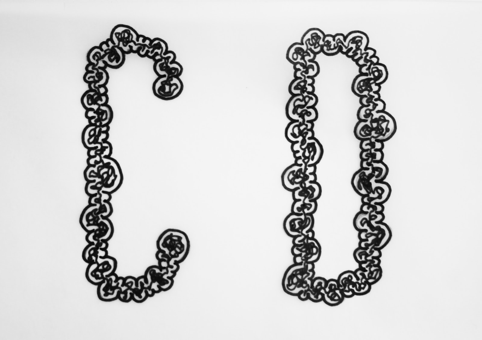
Each
letter is completely individual, none of the bubbles are arranged in a pattern
an neither are the doodles. As all the lines and curves that make up each
letter are hand drawn it means there are no elements to any part of the letter
of the letter itself that are the same.


-->
No comments:
Post a Comment