The
focus for my publication, iconic British automotive design, stemmed from my
research into Jaguar cars, specifically the E-Type, that then moved into other
iconic British cars.
I
wanted to aim my work towards the more stylish and sophisticated of British
gentlemen as I though this would be the audience that would be most interested
by something like this. There are no specific high-end automotive magazines,
however, GQ has car articles and is targeting the exact audience I wanted to
aim my publication at. I therefore decided to use GQ as the basis of my
publication, not however copying or emulating their style, but producing
something that would appeal and interest their readers with the same finesse
that GQ has.
My
initial idea was to produce a small bound book/publication/supplement that
would inform the reader of some of Britain’s most iconic cars; something
similar to high-end magazines and publications, such as Creative Review and GQ.
After some careful consideration and having come up with other designs,
producing a fully bound book would not be possible to produce to the standard
and quality I would want. With this in mind I decided to create a non-bound
collection off cards that contained the same information as the book.
I
didn’t want to produce just a selection of cards as they would have no real
value or point, however, I didn’t want to produce something bigger than
magazine size. Although it would not be bound, I still wanted to produce a
publication that would be a supplement to an edition of GQ.
GQ
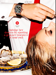
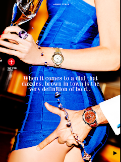
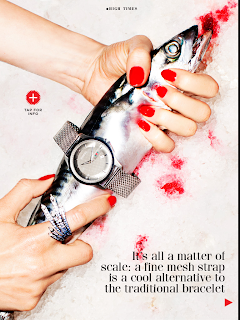
recently produced a supplement to their magazine, focusing on watches. The
publication is extremely crisp, sharp, engaging and informative. It iPad
version of British GQ Watch Guide is
also extremely interactive, allowing you to gain more information by touching
certain areas. The amount of information within the supplement is impressive,
containing opinions, images, style guides, interviews, infographics, links out
and illustrations.
GQ as a publication is spread over both print and digital and therefore I wanted my publication to be in both forms, printed and as an epublication.
Due
to my limitations, however, I will not be able to make my epublication interactive,
instead it will be a simpler page/slide publication.
My
main focus for this piece of work was layout, and after having a critiwue to
discuss whether what I wanted to produce would be suitable, this is where I
started designing.
Before
I could produce initial designs, however, I needed to make a decision on the
content and elements to the work.
There
will be slight variations between the printed supplement and the digital one
due to how they will be used.
Main
Components:
Front
Cover
Introduction
Contents
1st
Car
2nd
Car
3rd
Car
4th
Car
5th
Car
6th
Car
7th
Car
8th
Car
9th
Car
10th
Car
References
The
differences between the 2 formats will be as followed:
The
printed supplement will be able to be printed double sided and therefore the
information on the front should relate to the information on the back.
The
digital supplement will be a continual document ant therefore will just be a
stream of pages.
The
cars that are documented in the supplement were chosen after putting a small
questionnaire into the public domain and using the most popular vehicles. The
people who filled in the questionnaire were mainly potential GQ readers and older
gentlemen who have grown up with the vehicles.
The
chosen cars were:
Aston
Martin DB5
Land
Rover Defender
Lotus
Elan
Jaguar
E-Type
Classic
Mini
Rolls-Royce
Phantom
Morgan
Plus4
Lotus/Caterham
7
Preliminary
Layout Ideas and Designs:
I
decided to cut the number of cars I looked at due to time restraints, as the
sections I wrote for each car took longer than I had previously expected. I
also chose to remove the contents page as I thought it was unnecessary and
surplus to requirements.
The
layout I settled on was the one I though functioned best, both printed and
digitally, as well as providing the most information in the available space.
The
layout, in terms of print, is 11 double-sided cards. These cards consist of; a
front cover with a blank reverse, a introduction with a blank reverse, 1st
car image with information on the reverse, 2nd car image with
information on the reverse…7th car image with information on the
reverse, 8th car image with information on the revers and finally
the reference page which can over flow onto the reverse if needed.
The
digital document is exactly the same as the printed document, but all of the
blank pages are removed and the information relating to the image is put to the
right of said image.
I
wanted to design the document so that it would appear perfectly on an iPad as
that is the only size restriction the work had. The printed supplement could
also be the same size, as it had no constraints.
Now
that I wasn’t binding the cards I wanted an alternative way of presenting them
and holding them together. My initial idea was to wrap them in black tissue
paper and seal them with a sticker on both the front and back. For this I
designed some simple stickers to seal the wrapped cards so that if they were to
accompany a GQ edition they would not just be put into a plastic sleeve.
I
chose to work with entirely black and white (with the excuse of the
photographs) as I thought it looked the most professional and aesthetically
stylish, powerful and in keeping with something you would find in GQ.
For
similar reasons to the colour I chose to use BodoniFLF Bold Italic for my
headers and titles. Bodoni is a sophisticated and elegant font, which is used
in high-end fashion magazines globally. I thought it was an appropriate font to
use as it emulates the elegance and sophistication of the automotive design,
the publication and the audience. After
some research into which body type fonts compliment Bodoni I chose to use
Futura Medium as it was simple, legible and readable, yet was not over powered
by the Bodoni.
BodoniFLF
Bold Italic
Futura Medium
A
decision I made whilst producing the supplement was to use only lower case
letter in my titles and headers. This decision was simply made because I
thought it looked better aesthetically.
As
I was unable to acquire primary photographs I sourced secondary ones. With
every photograph I sourced I had to ensure it was printable in CMYK, making
sure the colours did not lose any of their properties. With each image I also
had to ensure the dpi was 300 so that they looked clear, crisp an unpixelated
when seen on screen. Finally all the images had to be cropped and resized to
the actual size needed so that they would function fully through all of the
software I was using. All of this photo editing and photo manipulation was done
in Adobe Photoshop.
Once
I had sorted out all of the photos, I wrote all of the information and found
all of the necessary facts for the main sections of the supplement. With this
all sorted it allowed me to use Adobe Illustrator to position all of the
components for printing.
With all the work finished in Adobe Illustrator I transferred all but the images over to Adobe InDesign. In InDesign I had set up a 20-page document that I could transfer my work from Illustrator into. Transferring all the positioned text from Illustrator into InDesign whilst, at the same time, placing different images into the document so it looked the same as the print edition was difficult and time consuming. This was due to some pages requiring the image to be placed before the text was transferred and vice versa.
When
everything had be correctly arranged in InDesign that was saved/exported as a
PDF so that it could be put onto an iPad
For
printing the Illustrator files had to be converted into PDFs. Each double-sided
card became a PDF and then they were all combined to produce a large PDF
containing every side of every card.
After the work had been printed it produced a problem. It became obvious that the black tissue paper I had intended to wrap the cards in would not be substantial enough and therefore not suitable.
As
an alternative container I produced a card envelope that was thick enough to
hold all 11 cards and allow them to be removed and replaced easily. This also
meant that the item became more of a collectable as it now had its own
packaging and holder.
The
stickers were used to seal the envelope and also as an aesthetic decoration on
the front, showing what was inside.

+(1).jpg)


No comments:
Post a Comment