Group:
Alex
`Dyson
Laura
Tomlinson
Melissa
Gater
Dan
Everitt
Will
Jeffrey
Jasper
Lee
Due to
our initial idea being impossible (see Communication is a Virus post on Design
Context blog) we decided to make people aware that simple changes in their
lifestyle would help them become healthier.
The
main focus of our concept was to get students, specifically from Leeds College
of Art, to take the stairs over the lift. We wanted to target people through
several different avenues. To create the greatest awareness we wanted to
produce a series of shocking and eye-catching posters, a booklet to provide
more detailed information, stickers to raise more awareness and finally some
flyers/leaflets to reinforce the message.
We
split up the process into three phases. The first phase was stir attention, followed by promotion and finally viral. Before we could start designing
and producing work we needed to decide on the content/logo/name, colour, tone
of voice and font.
After
some discussion we decided to use Bebas Neue as out main font as it was bold
and simple and had a good impact when increased to a larger point size. Due to
the limitations of the brief we chose to use black and yellow on white stock.
We decided on these colours because black and white have the highest contrast –
creating the greatest impact – and yellow would make elements stand out. For
the tone of voice we wanted something that students would connect with,
something on their level. As we as students ourselves, it made finding this
tone of voice easier. The tone of voice we settled on was one that was
suggestive, forceful, profane, risky, (mildly) offensive and sexy. Dan came up
with our name, FACT, where the c was hidden or not as obvious so it infact said
FAT. This became the foundation for the website that was called thehiddenc.
Our
initial poster concept was to use visually shocking images, combined with
hard-hitting, slightly offensive and mildly amusing slogans. The posters that
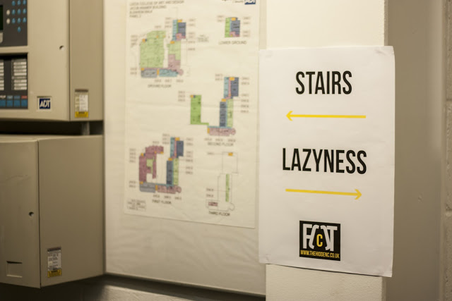
were to be placed in the lift were to be offensive, negative and suggestive,
where as the posters on the stairs were supposed to be more encouraging and
positive.
Negative
Lift Posters:
Positive
Stair Posters:
At the
same time as I created these posters I also came up with some logo design
ideas.
Whilst
I was producing my poster and logo designs other members of the group produced
some so that we had an array of designs to chose from.
The following designs were designed by Will:
The following designs were designed by Alex:
With
our plan set out in phases and a wide range of poster and logo designs we had a
preliminary critique to discuss our work. From this critique we received
feedback on all our poster and logo designs. The feedback we received on the
posters was that they were very shocking and had a powerful impact, they were
something that you would remember and that they were something that would
appeal to students. The overall opinion was good, however some of the designs
were deemed too offensive due to the disgustingness of the images. Another
problem that was picked up on was the rights to the photographs, as we hadn’t
taken the photos ourselves we didn’t have the right to use the photos and
therefore had to take our own shocking photographs. The final point that was
taken from this critique was that any profanity would have to be censored.
Although
the posters did exactly what we wanted them to do, we were advised to redesign
the posters as they may cause offence.
As we
were advised to change the poster images and censor the profane language, we
still wanted some photographs that were shocking and had a powerful impact. Due
to needing to have the rights to the photographs we decided on a photo shoot of
several members of the team horribly eating McDonald’s. Although this was not
as shocking as the grotesquely fat people it was still shocking and attention
grabbing. The photographs were mostly taken by Alex, however, Dan and I also
took some. Dan then came up with the idea to put tape
around our faces in some of the shots to represent the fact our body was built
and made of what we are putting into ourselves. This just disfigured the face
more, making the images more shocking.
The logo was also decided on and finalised so
that I could be used on all our posters, leaflets, booklets, website, Twitter
and Facebook. The logo we chose was one that I had designed. The design read
fat, however the A is composed of two brackets that have been pushed apart at
the bottom and pushed together at the top. This gives the appearance of an A
whilst also looking like it is fat. Within the brackets is a small yellow C to create
the FACT and emphasise thehiddenc.
Whilst these elements were being decided on
and finalised Alex was creating all the website, Twitter and Facebook pages
which were to be used for all three phases, especially the third and final
phase.
The final posters we created were split into
two different series. The first series were the photographs, converted into
black and white (due to limitations on number of colours and to provide the
greatest impact) and with the logo added on. These were the posters that were
supposed to grab the attention and shock people into investigating. The second
series were purely type based, providing a little more information and insight
into what we were doing. The photographic posters were designed and composed by
Will and Alex and the type based posters were designed and digitised by Will
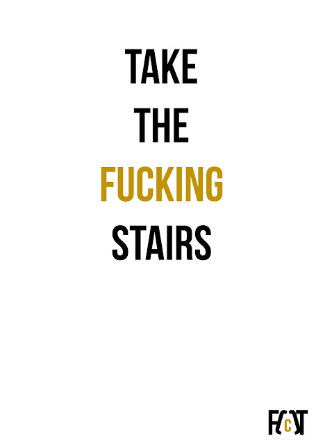
and I. The layout design for the type based posters – the central alignment
with the main test in a large black font and the more profane element in
smaller yellow font (meaning that it was not as openly offensive however it was
still readable and the viewer would have to get up close and personal with the
poster to grasp its full content) – was designed by myself.
Photo Based Posters:
Type Based Posters:
Note: The following posters do not all contain the correct logo or colours.
The following designs were designed by myself:
The following designs were designed by Will:
Final Posters:
Once all the posters had been finalised, they
were printed out and put up around college by Alex, Dan, Will and Melissa.
Posters in Context:
Whilst the posters were being produced and put
up, Melissa and Laura were designing and producing the booklet that would hold
more information about what we were doing and the facts about it.
The way that the booklet was designed was that
it was an A3 sheet folded together so that I could hold a selection of small
cards. The cards can be removed and handed around so that they raise more
awareness. The clever element to the booklet that was when all of the cards
were removed the structure could be unfolded to reveal a poster with facts and
figures on steps that need to be taken when related to McDonald’s meals.
There were two further planned developments to
the project and one that was a reaction development. The first of the planned
developments was the stickers. The stickers were initially designed to create
more and wider awareness, however, due to how the project developed, they were
designed and used as the positive statements on the stairs. The reason they
were changed to this was to provide another alternative method of delivery that
we believed students would react to. The stair stickers were designed, produced
and distributed by Will and Alex. The stickers were designed to give people who
took the stairs a positive feeling as they did not take the lift.
The final planned component of the project was
a leaflet that was cheaper design. The leaflet was designed by Will and
produced by myself. Theses were produced
in a ‘hot dog book’ format and were made at a size that could easily fit into
your pocket. The content of this leaflet was not as informative as the booklet
and was more aligned to the posters, using similar language, tone of voice and
incorporated the photographs taken for the posters.
Due to some regulations in Leeds College of
Art all of our posters were taken down and thrown in the bin. This was done
after we asked for permission to post them up around college. Due to these
posters having been thrown away and due to the title of the brief was Communication is a Virus, Dan, Will and
I produced two more posters in a aim to get people to remove the posters. The
content of these posters was similar to the rest, without the profanity and
more suggestive.
100 of these posters were distributed around
the college, compared to the 30 that had previously been distributed. The aim
of these posters, as well as to stir attention, was to get people to walk
around college to remove the posters. They were effective and worked, as all of
the posters were taken down and posts were made to the Facebook page by people
who had taken them.


No comments:
Post a Comment