After
all the investigations into type, colour and layout our final brief was to
produce either a publication or 10 double page spreads. I chose to produce a
small publication. The 10 things I chose were;’
1. Take risks
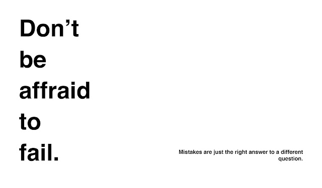
2. Don’t be afraid to fail
3. Typography isn’t the be all and
end all
4. You need colour theory too
5. Print vs. Digital
6. Grids & Layout – Guides not
laws
7. Communication is key
8. Photoshop // Illustrator // InDesign
9. Notes & Sketches
10. Type & Image
We had
to create the publication on our own custom size paper. My publication page
size is 150mm x 130mm, meaning a double page spread is 150mm x 260mm.
In terms
of design I wanted to create an extremely simple modernist publication,
focusing on the use of different grids and layouts and filling in the content
as appropriate.
As part of my development I looked into interesting magazine and publication layout to get inspiration (see Design Context blog). After I had done this i produced a variety of different thumbnail layout designs that I could have potentially used.
As part of my development I looked into interesting magazine and publication layout to get inspiration (see Design Context blog). After I had done this i produced a variety of different thumbnail layout designs that I could have potentially used.
The
Design:
I
chose to use Helvetica Bold for the majority of the publication, as it is the
ultimate modernist functional font. All of my type’s point sizes are the
Fibonacci sequence so they all look proportionally correct with each other.
Once I
had finished the design I printed it. Printing a booklet requires specific
printing setting on InDesign and with the printer its self. The first change is
you do not press print but print booklet. You must ensure that the bind is set
correctly – 2-up saddle stitch and short-edge binding is selected and you
should check ‘print blank pages’. This can change depending on how the
publication is to be bound. Other standard printer adjustments should be made,
such as page size and orientation.
Once printed
it can simply be folded and stapled if that is how you wish to bind it.


No comments:
Post a Comment