Once
the brief had been deciphered and re-written it allowed me to move on with the
designing. As it had asked to reconnect the younger generations with their
historical and natural surroundings, I wanted to redesign the logo to give it a
more modern twist.
First
I decided what was wrong with the existing logo and what could make it more
appealing to the younger generations. The main issue I found with the logo was
that the serif font was very dated and formal, meaning it was not as
accessible.
I
produced a variety of initial ideas, possible wording and different layouts so
that it gave me a variety to chose from.
The
logo I chose to take forward was almost entirely typograpgic.
For
my chosen logo I completely changed the font from a very fine, elegant serif
the much more modern bold Helvetica. Helvetica was chosen as it will connect
more with the younger generations and it is a very functional font.
The
logo is a very important element to the National Trust and therefore I wanted
to keep some of the current logo in my contemporary redesign.
To
do this, I kept the famous and iconic oak leaf.
I
experimented digitally, placing the oak leaf in various different positions,
however the design that was most effective was the design where the oak leaf
replaces the diacritic dot on the ‘i’ in National Trust.

Like
they have already dropped the ‘the’ to make it less formal I have removed the
capital letters, again reducing the formality.
With
a much more modern logo I proceeded to design a variety of posters for an
advertising campaign. I used the same font – Helvetica Bold – to produce the
posters. I chose to create only typographic based posters as they stand out and
are unlike existing NT publicity, which is highly photographic. I wanted to
intrigue people to go and find these beautiful landscapes and grand historical
monuments, rather than show them a picture for it just to be forgotten. My
poster content is split into several themes. I chose to split it into themes as
I had lots of ideas and was not sure which were the best.
Some
of the themes have more poster designs as they were more developed than the
others. The categories/themes were; general phrases, famous quotes, technology
related, literary referenced and directional.
General
Phrases:


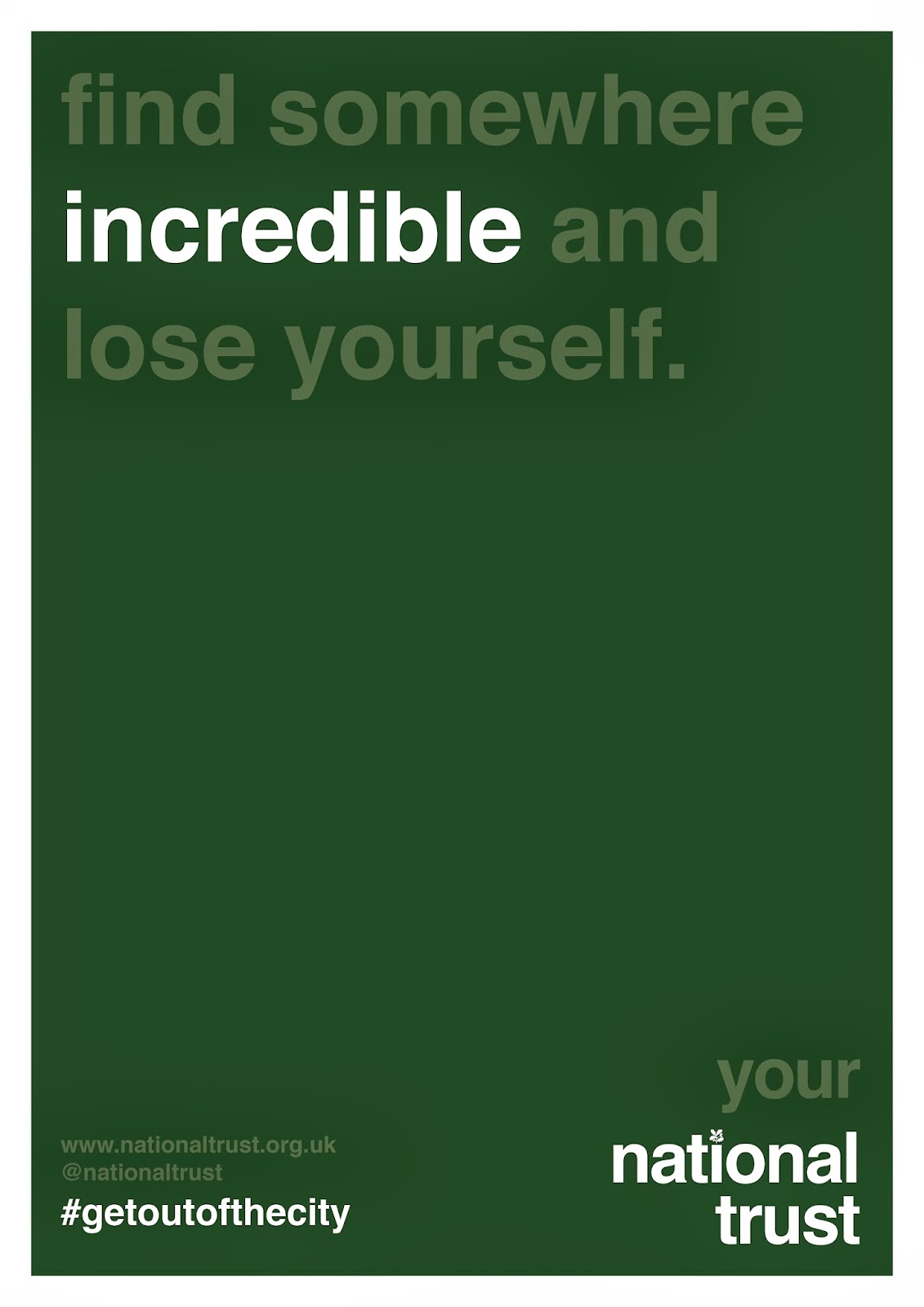


The general phrases were ones that would ideally persuade anyone who saw them and connected with them to go and visit National Trust locations. The tone of voice was not forceful but more suggestive, enticing and intriguing. The tone of voice also had to be entirely positive about the National Trust and show how it would improve the persons life by visiting.
Famous
Quotes;


The famous quotes, although quite cliched, were used to add a grandeur and a history to the campaign. I chose quotes to do with the natural and the historical as these were the most appropriate to the National Trust. With some of the quotes it was also possible to pick out certain elements that were completely relevant to the natural and historical. I picked these out by changing the opacity of the other words to 50%, so that the important information stood out however the whole quote was still visible.
Technological:


The technological themed posters were produced as they are specifically appropriate to the target audience, as they are up to date and using technology. These highlight the fact that people spend so much time on the computer, on their iPhones or other digital media that they do not appreciate what is around them. The tone of voice for these posters was more playful and the opacity was again changed to highlight some of the more relevant information.
Literary
Referenced:


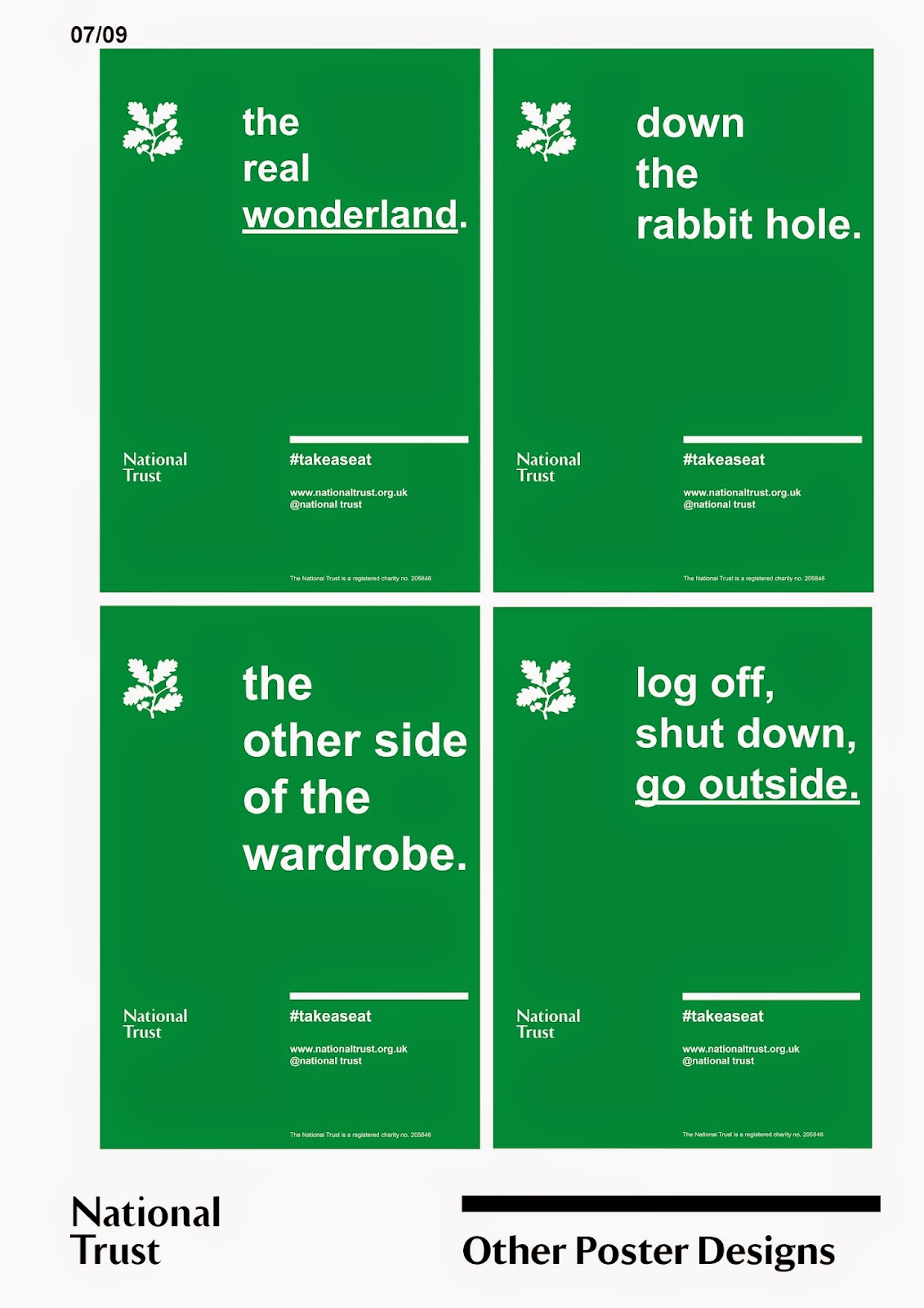
The literary referenced posters were designed on a whim as the idea popper into my head whilst thinking of words to describe the natural and the historical. There are references to wonder and magnificence in nature, showed through references to two famous literary texts; Alice in Wonderland and The Lion, The Witch and The Wardrobe.
Directional:


The directional posters were designed to add a direct dynamic to the campaign. They are positioned in locations that are not too far from the destination to highlight how close to a National Trust sight they are. The also have information on them that would enable to you get there. Again a change of opacity was used to highlight the most important and relevant information.
Each
poster also contains the logo with ‘your’ above it, in an attempt to make the
view feel like they are a part of it. Each poster also includes the website and
twitter information so people know where to go if they want more information. I
also have included a hashtag to tie all of my elements together.
I
was not sure on what the best wording for the hashtag. I had two possible
options, #outofthecity or #getoutofthecity.
A
hashtag was added as it is an appropriate way of engaging the younger
generations as almost everyone is on some form of social media, be it Facebook,
Twitter, Instagram, etc.
The
hashtag and social media element also works as publicity as the more people
tweet and post it the more people will see it and want to be a part of it.
As
well as the advertising campaign I wanted to do something that was more
interactive and was something that would be really memorable and identifiable
to whoever saw it.
I
had originally wanted to bring the natural and historical surrounding into the
city and its spaces. My first thought – after having done some research – was to
replicate the countryside or National Trust location in some form or another
like Lloyd’s Bank did with their tea garden.
Things
like these really stand out in cities and really get people involved.
At
this point we had our first crit and I presented my ideas on 3 design boards.


In the crit I presented the research and work I had undergone already and proposed some other ideas I had come up with. The proposed ideas were that of pairing benches in city locations with benches in National Trust locations.
The feedback I received from the crit was on the whole positive;
INSERT CRIT FEEDBACK HERE
After the crit I experimented with a few ideas that had been suggested in the crit, such as changing the orientation of the posters so I could see if they would work on billboards and in magazines.
I also attempted to visualise my pairing/twinning of the benches idea. This was more difficult than I had thought and I was still not happy with how they were presented when it came to the final crit.
For the final crit i produce 2 sets of design boards. The first set of boards showed my ideas and design decisions and the second set were a collection of all of my posters so that I could get an opinion on which ones worked best and were the most effective.


I was still not happy of the way the interactive element was presented and need to come up with a better way to display my idea.


The poster boards showed all of my poster designs, as well as some landscape options so that it showed how the designs could function in different situations.
I also produced a selection of questions so I could focus the feedback I received. Below are my notes from that crit.


At this point in the project I was happy with my progress, I had a strong concept, clear design decisions and a good amount of development.
I left the project for a few weeks to work on other briefs. When I returned to the brief to prepare it for submission, I realised that there were several changes that needed to be made.
I had read the National Trust brand guidelines provided in the brief pack and there were several elements of my design that did not fit with the guidelines.
The changes I needed to make were;
Font
Logo
Colour
Layout
The guidelines were quite strict on how the design should look. There should be no changes made to the logo and it should only be used in a few select ways. The fonts that were allowed were very specific and they have their own typeface and that was to be used. They also had a selection of permitable colours that should be used as they were. No tints or variations of colours were allowed either. The layout also had to follow guidelines so that the information was consistent through out their work.
This was a slight irritation as I had already produced a substantial body of work, however, I should have read the guidelines at an earlier point in the project.
The fonts I was allowed to use were the National Trust's own typeface and Arial.
The colours I chose from their selection were very similar to the colours I had previously used. They were;
Pantone 525 C50 M85 Y0 K20
Pantone 356 C90 M0 Y100 K20
With all this in mind I redesigned all of the posters, removing any tint and replacing them with an underline so the effect was still visible.


I also redesigned the plaques that would go on each bench using the correct logo, fonts and colours.


The guidelines were quite strict on how the design should look. There should be no changes made to the logo and it should only be used in a few select ways. The fonts that were allowed were very specific and they have their own typeface and that was to be used. They also had a selection of permitable colours that should be used as they were. No tints or variations of colours were allowed either. The layout also had to follow guidelines so that the information was consistent through out their work.
This was a slight irritation as I had already produced a substantial body of work, however, I should have read the guidelines at an earlier point in the project.
The fonts I was allowed to use were the National Trust's own typeface and Arial.
The colours I chose from their selection were very similar to the colours I had previously used. They were;
Pantone 525 C50 M85 Y0 K20
Pantone 356 C90 M0 Y100 K20
With all this in mind I redesigned all of the posters, removing any tint and replacing them with an underline so the effect was still visible.
I also redesigned the plaques that would go on each bench using the correct logo, fonts and colours.
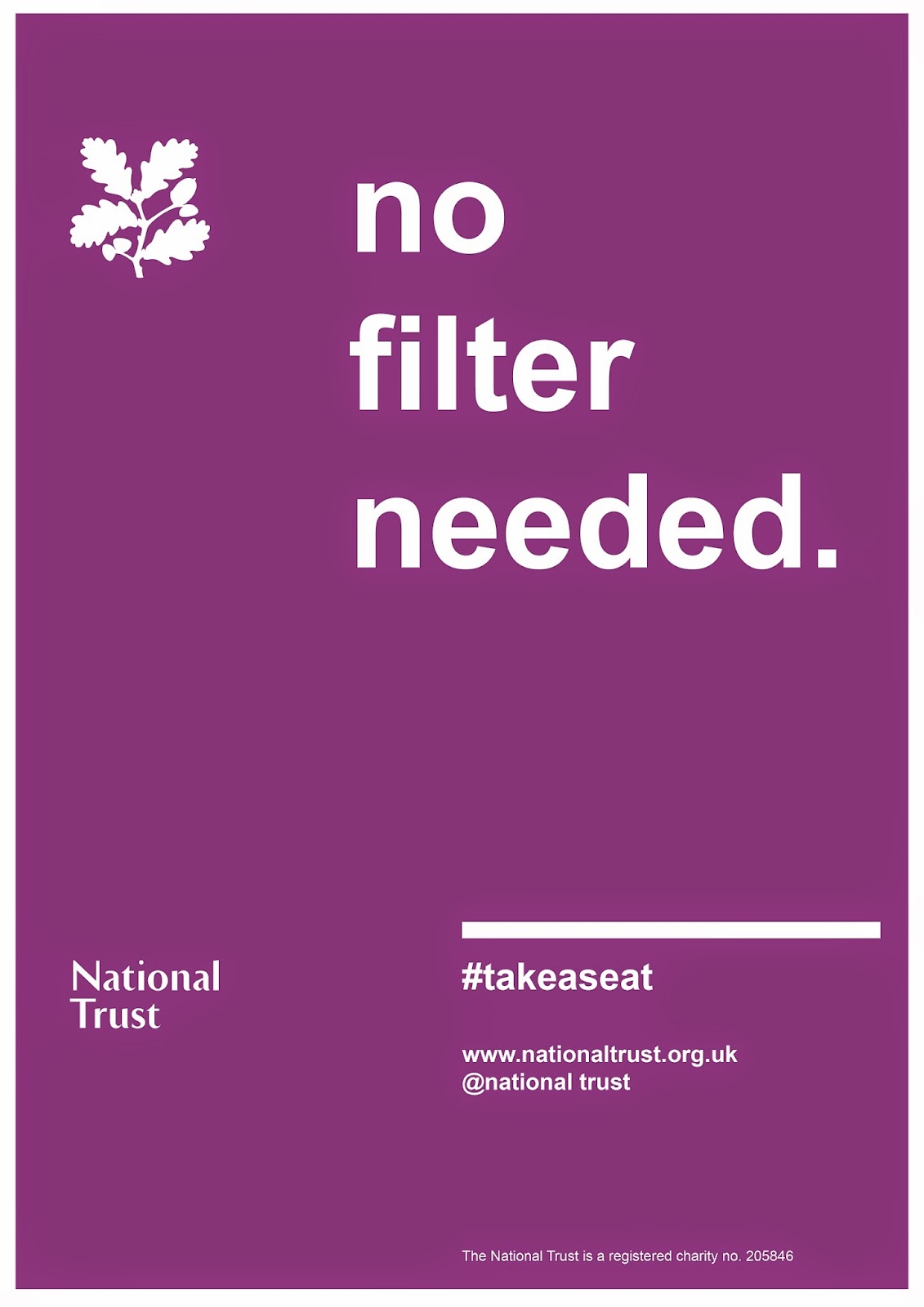
After the crit I also made the decision to change the hashtag from #getoutofthecity to #takeaseat. The new hashtag is much shorter and therefore easier to type and say, it is also less forceful and more encouraging and also fits better with the 'Twinned Benches'. The new plaques also contained the National Trust's charity number.
Now that I was happy with the concept and the design I wanted to create a set of submission boards that conveyed my concept correctly and had good impact. To start with I needed a better visual for the 'Twinned Benches'.
Using one of my own photographs I carefully imposed my pattern onto the bench.


The impact board was just the image of the bench with the chosen pattern. Each board included a number and the National Trust logo so that there is a consistency of design throughout.

The second board was the first that detailed the concept. Using a simple yet effective illustration to show the twinning of the benches, the copy explains precisely what the concept is. The design of these boards was done in-keeping with the guidelines of the National Trust.

The third board was a continuation of the concept, this time showing the plaques and informing about the patterns and colours used on the benches.

The fourth board is not as aesthetically strong as the others but it was needed to show the audience, colours and fonts used.

I then chose to have an impact board showing the campaign in action.

The sixth board informs about the campaign and all of its features, as well as the other possible uses of the adverts.


Now that I was happy with the concept and the design I wanted to create a set of submission boards that conveyed my concept correctly and had good impact. To start with I needed a better visual for the 'Twinned Benches'.
Using one of my own photographs I carefully imposed my pattern onto the bench.
I used two different patterns and two different colours to give myself two options as to which to use as my impact board. After some careful though and a discussion with my peers I decided on the purple image to be my impact board.
Now that I had all my information and design done, I was ready to produce my boards for submission.
The impact board was just the image of the bench with the chosen pattern. Each board included a number and the National Trust logo so that there is a consistency of design throughout.
The second board was the first that detailed the concept. Using a simple yet effective illustration to show the twinning of the benches, the copy explains precisely what the concept is. The design of these boards was done in-keeping with the guidelines of the National Trust.
The third board was a continuation of the concept, this time showing the plaques and informing about the patterns and colours used on the benches.
The fourth board is not as aesthetically strong as the others but it was needed to show the audience, colours and fonts used.
I then chose to have an impact board showing the campaign in action.
The sixth board informs about the campaign and all of its features, as well as the other possible uses of the adverts.
The final board shows the other side of the campaign. The posters with the phrases rather than the locations.
To accompany my submission I also produced a gif. that showed the different patterens and colours the benches could be painted as.
As I was still unsure of which of the posters were the best I produced boards for all my other poster designs as well. These could not be submitted as there was a limit on what you could submit.
This is my strongest project to date. It has a very strong concept that applies to the require audience as well as a much greater audience and a good campaign that works alongside the main concept. The project is also interactive and has a hashtag that enables its success to be followed and monitored. The project also follows the National Trust guidelines so does not need any adaption and is easily recognisable. The project is intriguing and uses a wider concept that is very popular at the moment - changing the city environment.
The weakness in this project is probably in the lack of variety in the campaign. Although I designed a wide variety of posters, I did only design poster and although they could be used on billboards and in magazines, I didn't show this. I also think that a wider range of colours could have strengthened the project even though I am happy with the two that I used.
This is a concept that could be used and would be effective nationwide. It is a concept that could also be used all year round although it would probably be most effective in spring/summer.
A problem that this campaign could face is that people take notice of the bench bit to not see the campaign behind it and therefore do not make the connection to the National Trust and subsequently don't visit the locations.
As as brief I have enjoyed this project. I think the break in the middle allowed me to come back to it with fresh eyes and, although I already had a firm concept, my design boards were much improved.
No comments:
Post a Comment