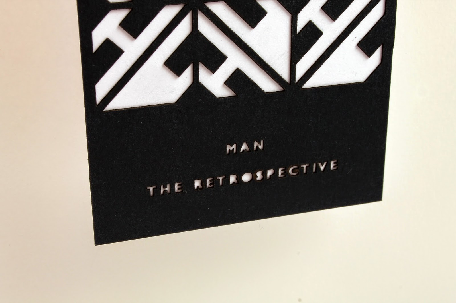
As part of the pack I also designed an produced the labels for the pack that each guest receives upon arrival at the Savoy.
First of all, I designed the labels for the bag and the labels for the Moet & Chandon Imperial bottle of champagne that was in the pack. The reason I chose to add this bottle to the pack was because they were, as a top champagne producer, a sponsor of the even an had a specific bar installed in the Savoy and would be served at the after-show party.
The labels were designed and produced in a similar way to the invitations, using two different types of stock, with the white stock printed on and the blue stock laser cut.
I used the monogram pattern and the champagne name on the front of the label, this was cut out using the laser cutter. The back of the label contained information on the champagne.
Once both components of the label had been printed, cut and glued together a whole was punched through the top of the label so that it could be tied around the neck of the champagne bottle.
The label that was designed to be attached to the bad was very similar, however, the writing on the front was changed to 'MAN THE RETROSPECTIVE' and the information on the back was changed to 'WITH COMPLIMENTS'.
When laser cutting I raised the stock off of the bed of the machine to limit the number of burn marks on the card. To do this a number of small metal pins are placed under the card. The problem this causes is that if the pins are not in a position to support the area that is being cut out, it can drop down and burn as the laser is not hitting it correctly.
The label, similarly to the champagne label, had a hole punched through the top and was attached to the bag using blue ribben.
For the event I also designed Press and Staff passes so that they could be identified on the day of the event. These were designed in the same format and way as the labels and they were also produced in the same way.
A similar issue with the positioning of the pins happened when laser cutting the staff card.
These cards did not have holes punched in them as they were not to be worn but carried.
There were two final components that had to be designed for the pack. The first was a card to hold the Hardy Amies silk handkerchief that was given as part of the pack. I had originally thought about just tying the handkerchief with the silk ribbon, however, having ordered from Mr.Porter.com, you receive a Mr.P handkerchief in a card. With this in mind I designed a card to hold the handkerchief.
The card was a simple folded card, however, it had two cuts in the back to hold the corners of the folded handkerchief in place. This was printed on the same stock as the back of the invitations, labels and cards. Finally, as the contents was pushing the card open, I tied it with the same ribbon that I used for the labels.
The second last printed element to be designed was a card that detailed the famous Hardy Amies Martini that is to be served at the show and after-show party. The Hardy Amies Martini is different to a conventional martini as it is not made with a lemon piece or an olive but instead is made with a curl of orange.
The card use the same long dimension from the invitations, however halved the shortest edge to make the card tall and thin. The same design and production method was used that I have used throughout to keep the design consistent.
The back of the Martini card details information on No.14 Savile Row and the Martini.


No comments:
Post a Comment