


The second experiment looks at the relationship between the contrast of temperature and some of the other contrasts. The other contrasts are; the contrast of saturation, the contrast of tone, the complimentary contrast and the contrast of extension.
The
relationship between the contrast of temperature and the contrast of saturation
can be seen here. The greater the contrast of saturation, the less strong the
temperature appears.


The
relationship between the contrast of temperature and the contrast of tone is
fairly similar to the contrast of saturation. The more tonal change in the
colour the warmer or colder it become, depending on the viewer’s perception.


The
complimentary contrast is visible when juxtaposing the colour associated with
warm and cold, as they are complimentaries of very close to being
complimentaries, even when the tone is changed.


As
they are complimentaries to get a balance the contrast of extension must be
done extremely. With complimentary colours the balance is usually quite
extreme, with one colour filling a very small space and the other a
significantly larger space.


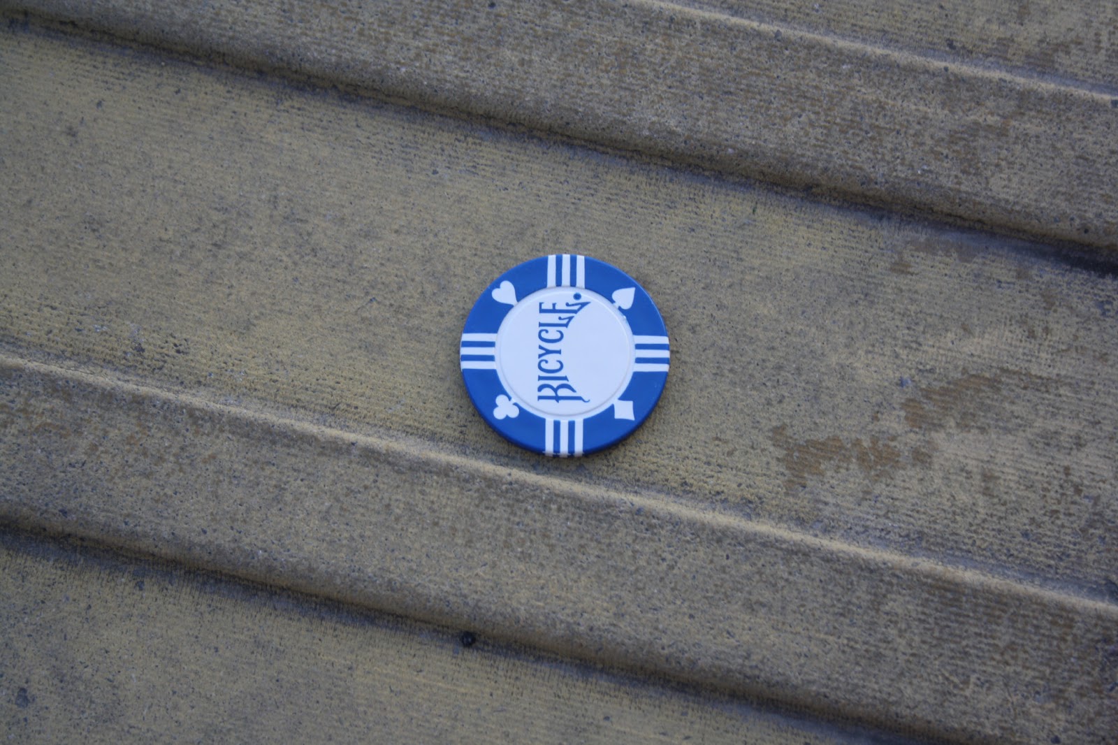
The
rest of the photos are the poker chips taken in various outdoor locations,
interacting with the environment, something that emphasizes the dullness of the
immediate environment but also make the chips appear brighter, looking at the
contrast of saturation.


The next study I did looked at how
light effects colour. Light is how we see colour and therefore a change in
light will change how we perceive the colour.
In
direct sunlight the colours are bright in ton and very distinguishable. Due to
the brightness and the intensity on the sun colours that are not very strong
appear desaturated.


Natural
light is very similar to direct sunlight however the colours do not appear
quite as bright and as vividly, yet they do not appear desaturated at all.


Under
an incandescent light bulb (a bulb that gives out a yellowy glow) the colours
appear slightly desaturated and tonally darker. In some more extreme circumstances
the hue becomes affected and the colours can change.


The
final light I exposed the coloured poker chip light to was a flash gun for a
camera. This had similar effects to direct sunlight and natural light. It made
the colours appear more vivid however potentially slightly darker tonally as it
makes all os the surrounding background much brighter and more vivid.


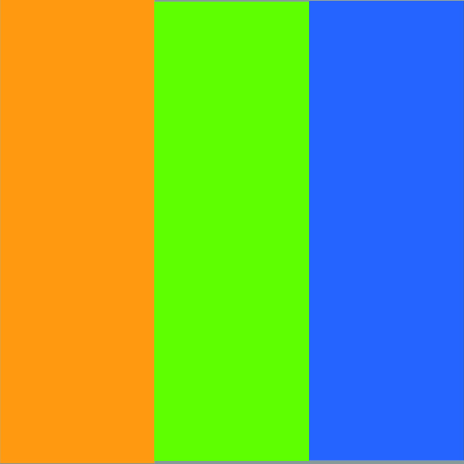
For this study I looked at colours that
work together. Colours that work together can usually be found next to or near
each other on the colour wheel. At first I just looked at the colours directly
next too each other. (Note: Colours have appeared differently to designed).


After
this, however, I looked at a 3 colours that worked together. All of the threes contained
a primary and a secondary colour. This is a process that could be taken much
further by adding a touch more of the colour next to it so it would smoothly
run into the next colour.


When
white was added, I found that the colours appeared brighter and more vivid to
the eye.


This
next experiment looked at how placing a colour on top of another would affect
the tone and saturation of both the object and the background.
The
orange objects appeared much brighter on colours with different chromatic
values, so for orange that is green, blue and in this case yellow. This also
brings complimentary contrasts in with the orange on the blue. In the space
between the two colours your eyes attempt to fill the abrup jump between colour
with the colours in between the two hues. This can be seen in several of these
photographs. Some of the orange object just stood out against the background, however
some, specifically the orange, really appeared to desaturate the background.


I
wanted to look in more depth at the relationship between the contrast of tone
and the contrast of saturation, the two contrasts I found to be the most
common. Focusing on the colour yellow, I collected a wide variety of different
yellow backgrounds and different yellow objects. I proceeded to place each
object on top of each background to the affect it had and how much the colours
appeared to change. I was surprised at how much the colours did appear to
change. For example when a desaturated background was used the object appeared
more saturated and brighter, the same can be said when the background was darks
the objects on top appeared brighter and more yellow where as the darker yellow
became darker and almost changed into a brown. This happened again when the background
was very yellow, close to a perfect yellow and the object on top had a trace of
green in it. In this situation the green really came out and the object looked
green rather than yellow.


No comments:
Post a Comment