Once I had the logo and colour set up it allowed me to create a whole brand identity.
I started off by creating a list of all the possibly paraphernalia and possibilities that could be proposed and breaking them down into sections. The sections I divided it up into were business / museum / gallery / cafe.
BUSINESS
Business cards
Letterheads
Envelopes
Stationary
MUSEUM
Signage
Maps
Information desk
Information leaflets
Staff uniform
Exhibition guides / leaflets
Interior
Exterior
Promotional posters
GALLERY
Signage
Maps
Information desk
Information leaflets
Staff uniform
Exhibition guides / leaflets
Interior
Exterior
Promotional posters
CAFÉ
Menu
Drinks list
Napkins
Signage
Reciepts
Packaging
Labels
Interior
Exterior
With this list I proceeded to design the business side of the company.
For this I produced a selection of business cards, experimenting with different styles, layout and sizes.


I just started experimenting with layouts and different design features. A decision I quickly made was that I wanted the front to be as bold and as simple as possible with all the required information to be on the back.


Although I had previously said I had decided on a logo, I briefly mocked up a business card with the alternate logo to see if I had made the right decision. the conclusion I came to was that the logo I had chosen is much more friendly and welcoming, qualities that make it very user friendly and therefore the better choice.


I experimented with two different sizes of business card. The most common American size and the most common British size. The American size is longer and thinner when compared to the British size.


The American size allowed me to layout the information in a more effective way so I chose to use this size. The American size also made it easier to mock up images as all the stock photos were of American sizes.


The original mock-ups where quite effective however did not have a massive impact, I think due to the lack of volume of cards in the images.
The next part of the business I decided to design was the letterhead. I found this design harder than I had imagined as everything I designed appeared too corporate or commercial. As it was for the business side of the company, however, I produced a design that contained all the necessary information.

I proceeded to mock-up the letterhead with some business cards to try and look more professional and more substantial than the previous attempt.

This image gives a much greater impression of the business cards and letterhead. This image also gives a better impression of the colour I used.
With the letterheads designed, I though it an appropriate time to design envelopes.
I designed a variety of different envelopes, using different layouts, different opacities of colour and different wording.


At this point I could not decide on which design I preferred or thought would work best so I made the decision to mock them all up.


Having mocked them up I though the most suitable design was design above. I made this decision because it has the logo on it, it has the name on it, it has an overall balanced feel due to the difference in opacity between the type and logo and it also has plenty of space for the address and stamp if required.
I also quickly mocked up a possible back of an envelope. The reason I though something was needed on the reverse is because letters are not always received the correct way up and this would allow the receiver to know where the envelop had come from with ease and it also added colour to an otherwise boring space.

The final mock-ups I produced for the business side of the company was stationary. I produced 3 mock-ups just visualising how the stationary could and would appear.


(For an unknown reason, Blogger is determined to completely ruin and change the colour and bightness of any photo I try and upload.)
After I had produced these mock-up I though that the third design probably had too much going on, however, looking back I think all three work well and this is something that could be taken further into the endless possibilities of stationary - pens, rulers, erases, etc.
The next aspect I chose to design and propose was the promotional material for the the type factory.
My idea for the posters was to use quotes from famous people that were related to type and typography. To start, I collected a range of possible quotes, noting them down.
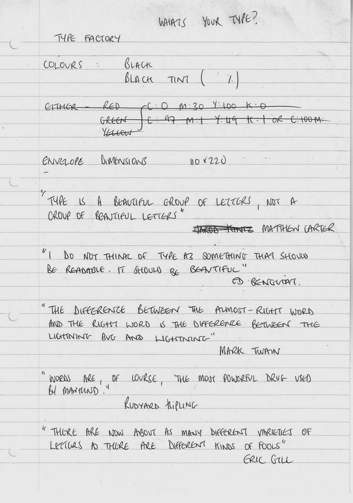
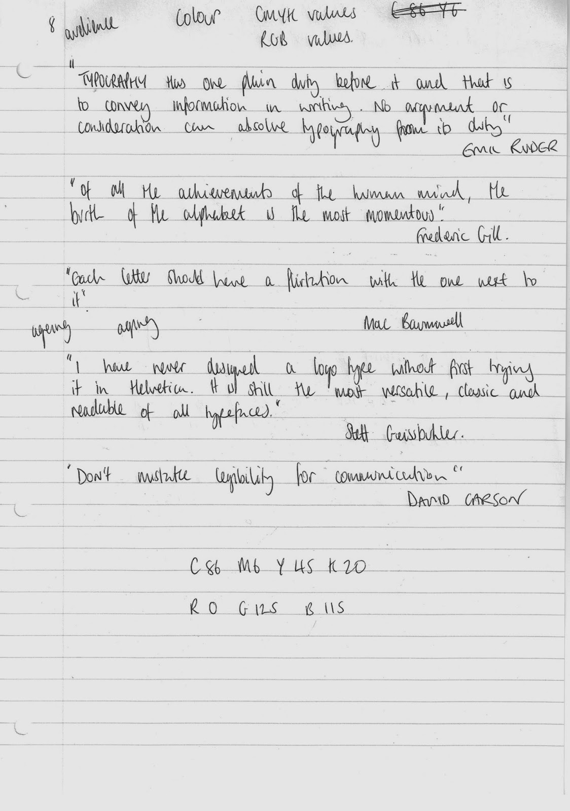
When I had collected some appropriate quotes I began to design some posters.


When I was designing the quotation posters I discovered that other relevant phrases could be found within the quotes. It was not possible with all the quotes, so I decided to use the quotes that it was possible with. The phrases that I highlighted were very positive about type and showed its importance.

Having serendipitously fallen onto these hidden phrases it got me thinking about what everyday phrases that we use have a reference to type that could be used as a poster.
The first phrase that came to my head was the one I settled on and it was the phrase above. This adds an element of cheek and play to the posters, balancing the slightly more serious quotation designs.

I also though a poster that just said what it all was, was important as the name is quite intriguing in itself it will get people to know what it is so they can link it to the other posters. The colour/log again, as with the stationary, pulls it all together.
Each poster also has all the important information on it such as location, contact details and web address so that anyone looking at the poster can find out more.
I then mocked-up the posters in real life situations to see how they would be viewed in the real world.


With what I though of as a good selection of promotional material for the type factory, I moved on to designing affects for the cafe.
The first elements I designed were napkins. The reason I decided to design napkins was because they are something that everyone who visits the cafe will use and get given and are a good platform to increase the brand identity.


I think the most appropriate design is the second design because the first is a bit overbearing and there is too much on the napkin. You do not want the napkin to take centre stage and therefore I think the second design is the best.
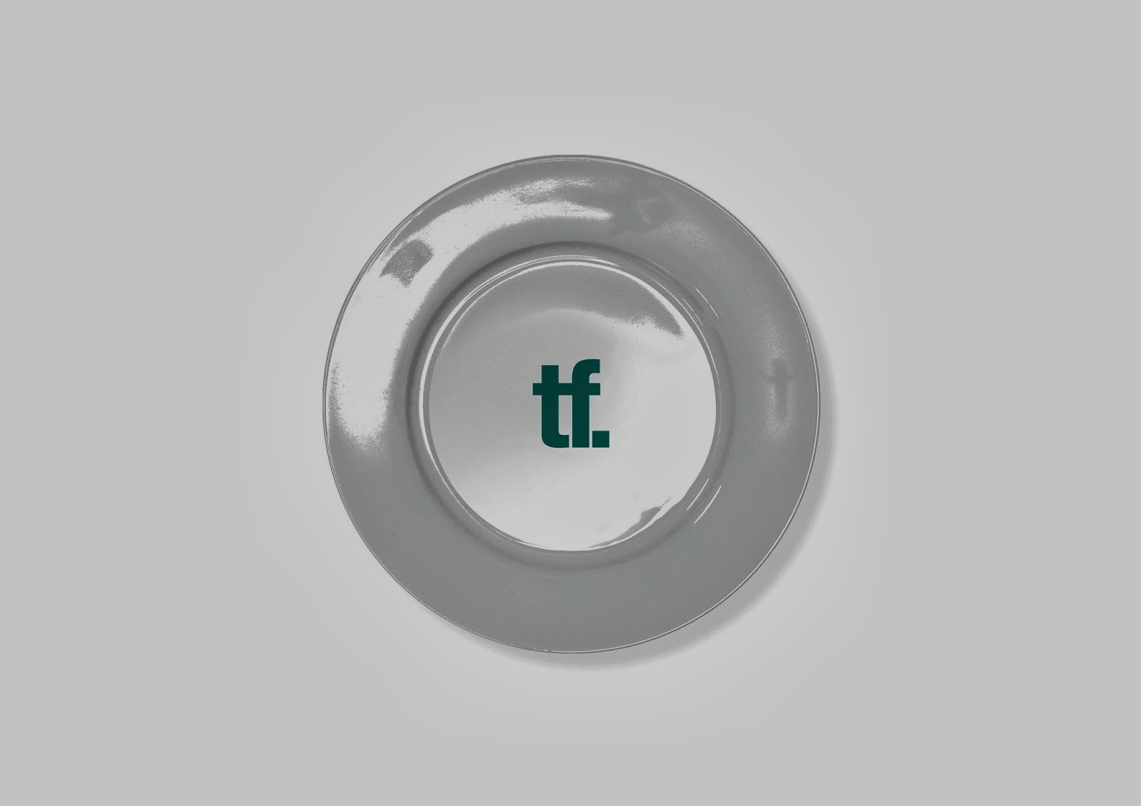
For the cafe I also mocked-up some simple plate designs just as a continuation of the brand to show the possibilities of what could be produced.

The final items that I designed for the cafe were a random selection. I mocked-up some packaging of things that would appear on the table - sugar packaging and complimentary chocolate wrappers.


I also designed 2 variations of compliments cards that could be used by the clients to write any feedback they have on the cafe.


An element of the company that would require merchandise that I had not originally though about was the shop, so I decided to use one of the poster designs an the logo to mock-up some bags that could be used in the shop if people bought anything.


I thought these mock-ups were very effective, however, I think the bag looks better without the green side.
I also mocked up a tote bag that could be sold in the shop.

As with the paper bags, this was a very effective mock up.
The shop could also sell the stationary and crockery that I have previously discussed as a way of making money.
It was at this point where we had our final critique on our work so far.
For the critique I produced a set of design boards to convey the concept and work I had done so far.


As I had not done any work for the digital side of the product there was nothing on that board.
Prior to the critique I quickly noted down what I wanted to get from it:

I wanted opinions on the logo, the font and the colour.
The piece of paper also contains the notes that I made during everyone's crit. I made notes of things that I needed to do and bits of information that I thought relevant to the project.
The feedback I received was on the whole positive.

Everyone was very positive about the logo, however the suggestion was made to reduce the point size of the full-stop smaller. This is something I did and it made the logo look less clunky.

The feedback on the colour was also extremely positive.
The only negative feedback given was the lack of digital work done, something I knew I needed to do.
I wanted to produce some more mock ups of the printed matter. I started by mocking up some staff and press t-shirts.


I also mocked-up some interior locations and some exterior locations. I wanted my gallery to be in a modern/contemporary building with white-washed walls and concrete floors, so I found some images like that and began to impose my logo on.


Whilst designing my website and coming up with the content I wanted to have a luxury restaurant at the top of the building - similar to the Baltic Contemporary Art Gallery. I produced a adapted a winter menu for the restaurant and designed it.


I chose to design the menu as tall and thin as I think it has a more sophisticated feel and that is what I wanted for the rooftop restaurant.
No comments:
Post a Comment