After producing several scamps, having them critiqued and reviewed I proceeded to draw out a number of other possible homepage thumbnails. The variety of thumbnails gives me a number of choices for the homepage. I wanted a home page that represented Barbour as a sophisticated and professional brand, whilst also appealing to the target audience.

I then chose, what I perceived to be the most appropriate and best homepages for my website and chosen audience.

With
these chosen designs I then produced a variety of different thumbnails for each
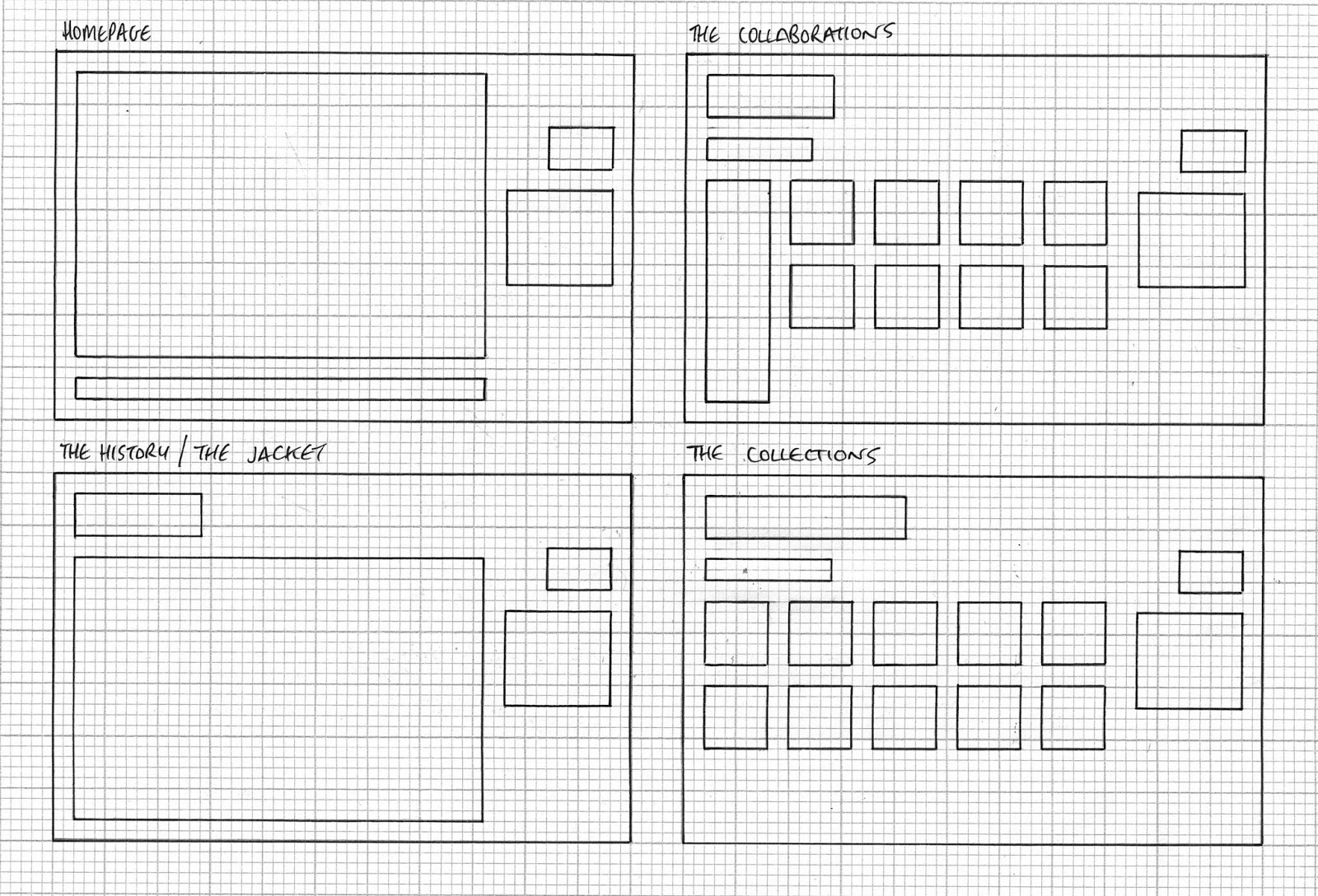
page of the design. This gave me 5 possible history pages, 5 possible jacket
pages, 5 possible collaborations pages and 5 possible collections pages. The reason I decided to produce 5 possible designs was because I wanted a range of pages to choose from before I started designing and coding.
I
then very slightly adapted these possible designs and created 16 different
wireframe thumbnails. These thumbnails did not show any detail other than the
grid systems and boxes where information would go.

I,
again, chose the most appropriate and best designs on paper and drew them on a
larger scale, choosing specific designs for specific pages due to the content
that was to be on those pages. This left me with two designs I wanted to carry
forward and produce digitally.

Combining the chosen designs and the thumbnails allowed me to take the designing onto the computer.
Although
I had already produced some of the homepages digitally, as well as one quick
mock up of a possible website, I had not done it thoroughly and properly.
I
produced the digital versions of the design to the approximate dimensions of
the thumbnails and scamps, however, I used grids I produced digital and used
the dimensions I could get off of those, as they could be more accurate.
I
had previously had an idea on what colours and font I had wanted to use,
however, during the digital production these were cemented.
These colours were Black at 80% and Black at 40%. To add an element of colour
These colours were Black at 80% and Black at 40%. To add an element of colour
I
had also known the logo I wanted to use but I had not yet had it in a format in
which I could work with. I therefore produced a vector of my logo so that it
could be used in the digital production as well as being saved for web.
Once
I had completed the digital designs I began to code.
I
initially set up my homepage (index.html), setting up my container, navigation
bar, logo placement and roll over buttons.
Once
this was coded, I proceeded to set up all the other pages
(history.html
// jacket.html // collaborations.html // collections.html) and link them
together.
Now
that I had a five page website with working buttons and links I proceeded to
develop the homepage using the chosen design.
I
then added a link bar in to the bottom of the page that contained a link to the
Barbour UK page.


This
was as far as I got with the coding prior to the critique.
Before
the critique I also produced a set of design boards to inform my peers of any
information that was not clear from my design and the reasons why I had done
what I had done.


FEEDBACK
This
is the feedback that I received from the crit.
The
questions I asked in the critique were as follows:
-
Is the design appropriate to the audience?
-
Is the homepage too simple, would a photograph be more
appropriate?
-
Should I use more//different colours?
-
Is the design a bit bland?
-
Other comments.
The
feedback will appear oblique and my responses to it will appear as normal.
Try making the logo smaller. It
is too stretched out and looks very ‘clipart’.
I
will take this on boards and see what the logo looks like when it is made
smaller and whether this looks better or not.
Try to make the navigation bar
clearer, maybe have it along the top.
I
have the navigation bar at the side to make it different and unusual to other
more corporate websites as the audience would prefer this. It also changes the
space I am left with to fill with content. Again, I conduct a few experiments
with the navigation bard to try and make it clearer.
Really like the clean style, it
works. It is clear and understandable.
The colours work fine I think.
Audience if definitely clear in
the design – clean, modern look is what I would associate with the audience I
have defined.
Not
much I can respond to the 3 previous bits of feedback as they are really only
ego boosting comments.
I like the homepage as it is –
there is nothing wrong with simple. If you are thinking of a photograph,
experiment with the idea. Something black and white though with the gold and
detailing? Keeping with the colour scheme.
The
reason I asked this question was that after critiquing peoples work I though it
might add to the website. I will
experiment with some photographic imagery and see how it looks.
The colour scheme reflects the
heritage and clothing style – no colours are needed other than these – maybe
incorporate the gold into the content pages a little.
I
also agree that the gold should flow through all of my pages I was just not
sure how to incorporate it.
Looks very ‘hip’ but if you
wanted to portray the rich heritage, introduce this somehow. Nonetheless
appropriate for the audience.
I
understand that there is very little that says heritage in the modern
aesthetic. I hope more of the heritage will come through in the content. I will
also look at the possible inclusion of the royal warrants of the name, date and
location in all of the pages.
Make the homepage reflect
Barbour. Are they simple or are they intense? Seeing as they are also about
products, it might be useful to show them on the homepage too – so the user
knows what the site is about automatically.
Due
to my audience I do not want my homepage to just reflect Barbour. I do admit
that the presentation of the website is not the usual aesthetic associated with
Barbour, however, it will appeal more to the chosen audience. I do think that
the integration of some form of imagery may add to the homepage so I will
experiment with this.
Colour scheme is good, maybe
generate another colour from the Barbour colour scheme.
I
was possibly thinking of using the barbour green or an opacity of it. I will
try this digitally to see if it adds or detracts from the design.
Issue with roll over button on
the history page.
I
have no idea what has gone wrong here. It does need solving before hand in.
Quite a few spelling mistakes
and grammar issues, they’ve been drawn onto your design boards.
I realise that the spelling and
grammar is not perfect, however the boards were and after though and I would
have rather had more feedback on the websites rather than the boards. There
will not be any typos or grammatical errors in my final boards.
I think that the design does
suit the audience, however, I’m not quite sure if it feels ‘hipster’ enough.
As
stated in my design boards there is a reason that the design is not all out
‘hipster’ and has a structured and clear aesthetic. This is to reflect Barbour
and its brand as that is the content of the website.
I really like the simplicity of
the homepage and the use of gold. I think the gold colour should be used
throughout the other pages in some way to add more of a sense of consistency.
This
is something that has been mentioned previously and something I want to do, I
am just not sure how best to do it.
At the moment, I’m not sure
about the navigation, as it seems out of place in comparison to the rest of the
layout.
This
is something that has also been mentioned before. I had not seen any issue with
the navigation and the rest of the layout. If does not move between pages. I do
recognise that it is not perfect and something does not feel quite right about
it. This is something I will rectify. It may be something to do with the width
of the page and that the page content on the homepage is aligned to the left
and the navigation is aligned to the right.
Also remove the ‘full stops’
from each roll over buttons, as they aren’t needed and make it look a bit
awkward.
I
will see how they look without, however, I think I tried this during the design
process and it did not look right.
I don’t think the design is
‘bland’, it just needs a bit more consideration and a few tweaks here and there
to make it work. It will come together when you code it all.
This
does not really help me to be honest.
Boards – TL;DR
Less writing more showing.
When producing more formal
boards, stay away from saying ‘I’. Clients don’t care what you want to do, they
care why and does it work?
This
is valuable information however at this point in the project I would have preferred
more feedback on the website and design rather than my boards. I will make sure
I do not refer to anything as ‘I’ or put my opinion in any further design
boards.
Using the swatches in the bottom
left keeps the reader in mind of branding and colour ways, which is a very
positive move.
Some
very valuable information again and it gives me something to take forward when
producing further boards, however, again I would have preferred more feedback
on my website and design.
Website clear to navigate
although you probably know you need to develop your content a bit more.
There
was no content actually coded, however, content was displayed in my printed
designs.
No comments:
Post a Comment