When I had the critique I only had the homepage fully designed and the other pages set up but not completed.
The homepage is the initial page that I designed and coded. The home page consists of 2 images, the navigation bar and the link bar. This was a predominantly static page with the navigation bar being the focal point. The navigation bar consisted of the logo and four roll-over buttons.
The roll-over buttons change buy halving the opacity when the mouse goes across them. I chose to do this rather than change what id said or make any major new design feature as it is simple but classy and that is the overall look of the website.


Each page of the website has the same navigation bar and feature with each page linking to each other. The logo links to the homepage as this is a conventional navigational feature that is used on almost every modern website. The layout of the buttons and navigation is the same, however, depending on what page you are on, that page's button will be half the opacity of the others, like it appears when you hover over it on the home page.
The first page after the homepage I designed and coded was the timeline page. When I had sketched all of my scamps, designs and wire-frames previously, I had the timeline horizontal, however when it came to coding it this was not possible as I did not know how to set up a horizontal scroll bar, nor would all of the information fit horizontally. I therefore decided to design the timeline vertically so that when you where on the page you started in 1894 and as you scrolled down the page it brought you towards the present day.
For the timeline I drew a line that was long enough so that I could insert the dates at accurate distances apart. As well as the order accuracy, I also devised a an accurate way of showing the most important bits of information. The longest lines show the most important points in Barbour's history and the shorter the lines get the less important they are.

In one of my crits I was advised to use the gold colour throughout to keep consistency and continuity. I used it as the colour for the dates on the timeline, along with black at the highest opacity for the lines.
I had originally intended for the content of the timeline to appear when the mouse was over the date, however, due to my limited coding knowledge I coded it to the best of my ability and basically used the whole timeline as a roll-over image. This means that when you hover over the date, all the information appears for the whole timeline.


The second contents page of the website that I designed and coded was the jacket page. This page was a very similar situation to the timeline page in that I wanted different bits of information to appear when you selected certain areas of the jacket, however, due to my lack of knowledge of coding I again design all the layout and created two roll-over images to show the information.
The second part of this page - the rewaxing section - was intended to be more interactive so that you could click on an image and it would zoom in and give you the information rather than just revealing it.


Although the pages were not how I had initially intended them to be they were still effective and and fulfilled their purpose.


The final two pages were very similar although different slightly in design, with the collaborations page having fewer pictures and being a less structured grid. Again, due to my inferior knowledge of coding these pages were designs and uploaded as images. These two pages are only information pages and have very little interaction other than to scrole through the content.
These pages contained more body copy than the others and as I could find varying amount of information on each collaboration the amount of content varies. For example there was a lot of information on the collaboration between Barbour and Tokihito Yoshida, however, there was about half as much for the Grenson collaboration.


When I was designing and coding my website I use a pad of paper to calculate all of my sizes as well as make my design decisions on and work out and not down anything I needed to do or remember. As with STUDIO BRIEF 01 I did not see the relevance of them to anyone else, other than me until it was pointed out in a seminar. I did manage, however, to selvedge most of the notes and decisions I made whilst designing and coding my website.
When I began designing and coding my website I needed to decide on a size for it to be produced at.
There are now multiple different screen sizes that can be produced for, from large 27" iMacs to tablets and mobile phones.
After reading an article on the most popular screen size (see Design Context blog), I decided to use 1360px X 768px.
I made this decision as this is the most popular contemporary screen size and as the audience for the website are younger then the assumption was made that they are more likely to have the more contemporary screen size.
I initially wanted to make the website responsive so I created the containers at 100% X 100% with the navigation bar at 20% X 100% and the link bar 3% X 100%. This was fine up until I needed to work out the other dimensions for the coding. When I realised this, I changed the values to pixels rather than percentages.

When I was designing and coding the timeline I primarily had to work out the length the design needed to be. I calculated that between Barbour's opening and now there 119 years. I then multiplied this by 12 to get the number of months. This gave me the number 1428. So, to provide breathing space, I created an art board that was 1600px long. I then drew a line of 1428 pixels and centred it - this was the basis for my timeline.
The width was calculated by taking the total page width and minusing the navigation bar and 2x50px to accommodate for breathing space.
I also made decisions on the horizontal line lengths - 250 / 200 / 150 / 100 / 50.
I finally made decisions on colour or black and white photograph, in fact choosing to go for a mix and the weight of the timelie line - 2 pt.

When I was designing the jacket I made decisions on the content, marking off what I had done and what I had images for. I was also working out the dimensions for the design and the RGB values for the gold colour.
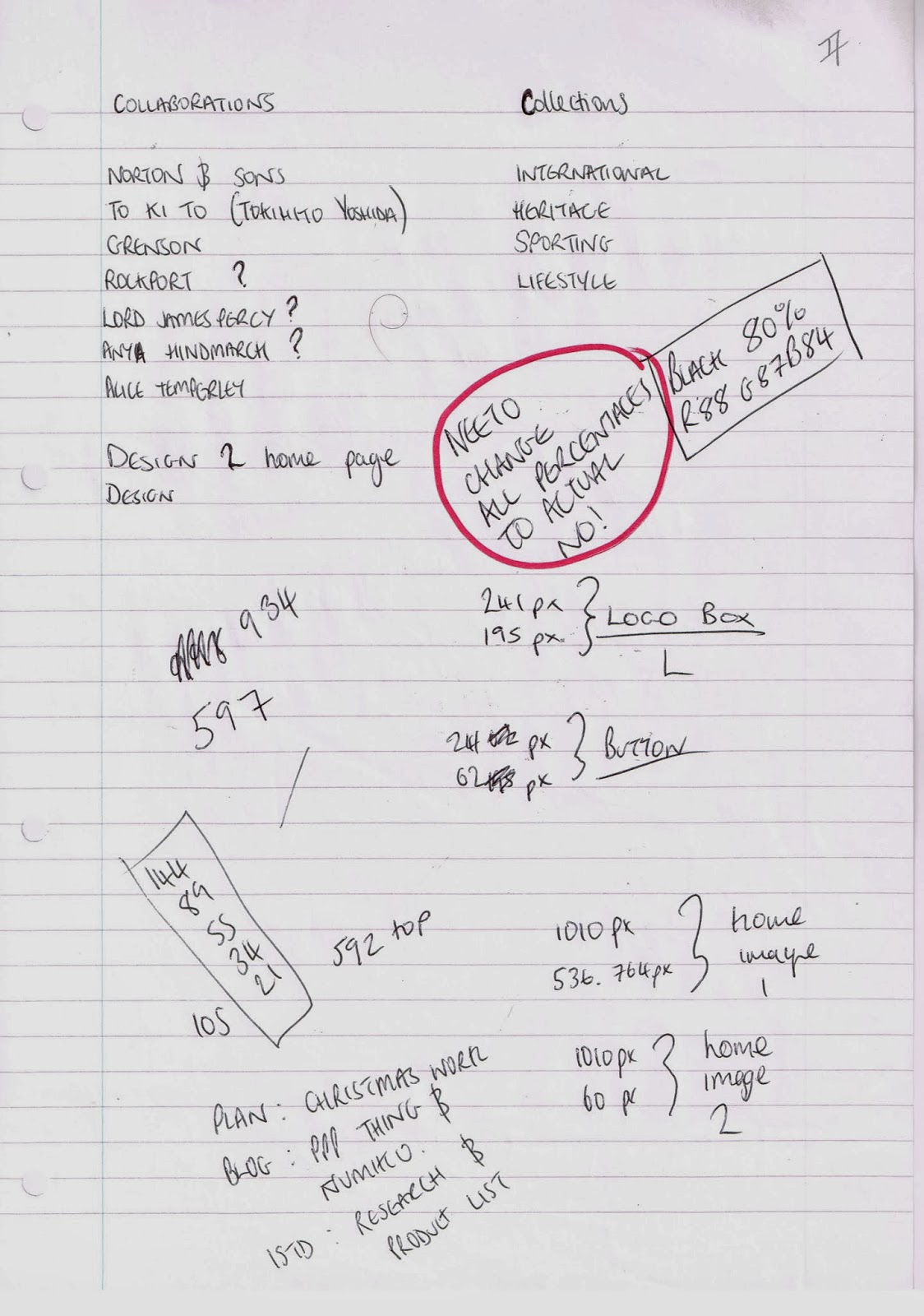
This page was my thinking and planning for both the collections page and the collaborations page, as well as logo and button information and colour informatio. There is a decision to change all of the dimensions from percentages to pixels, dimensions of the buttons, logo and the images on the homepage. There is also the beginnings of the decision making on what collaborations to focus on, on the website.

When I was designing the collections page I was noting down the content ans what would be written about each individual section. Again, the decisions about the size and colours used - which are the same throughout are made and finally ad decision on the order in which the collections should be designed was made.

The page above shows the decision to focus on 4 main collaborations and mention the rest. the reason I chose to do this was because 4 of then were more appropriate to the audience and, whilst the others were not unimportant, they were not as relevant.
There is also the repetition of the colour, obviously something I kept forgetting and had not saved a swatch and the width of the page itself.
Finally on that page and the following pages are my decisions and choice of content for the collaborations pages. I have written down key points about the collaboration that i intended to use in the design and content of the web page.


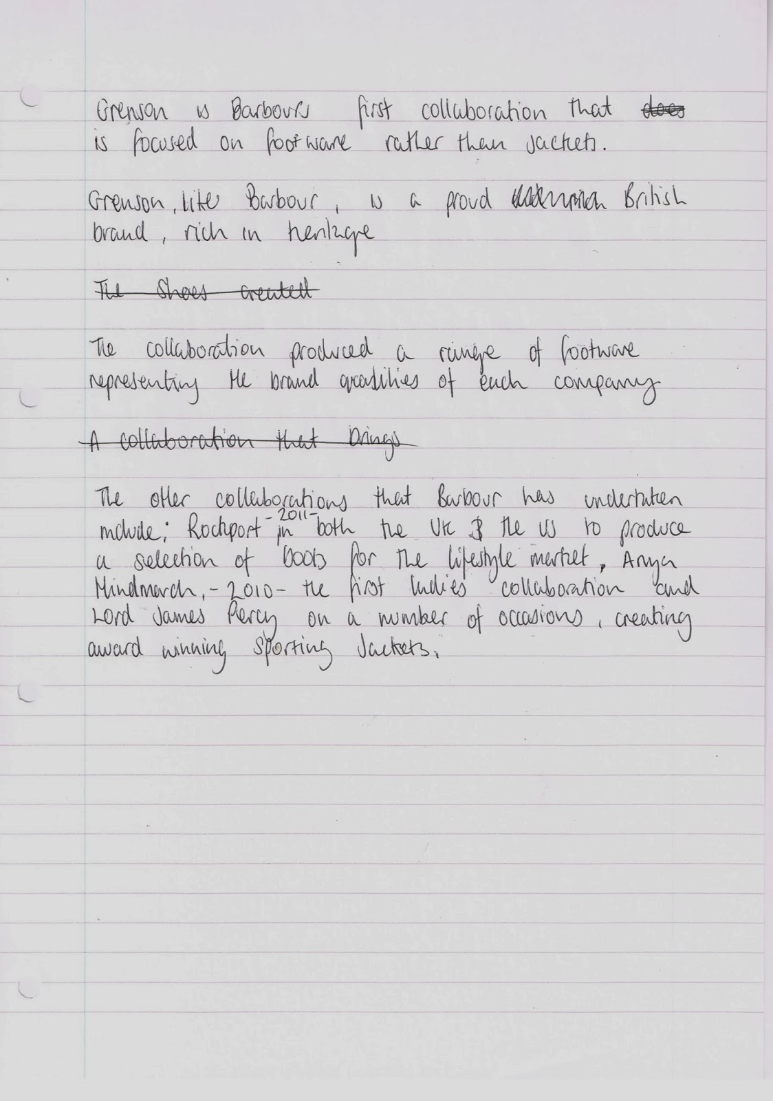
There were element that I chose to take forward and use as the content of the webpage and other sections that I ruled out. I also changed the phrasing of the content to fit my audience.

No comments:
Post a Comment