Dialogue was a blind collaboration screen print exhibition organized by Yoke. The brief was to produce a single black and white design on the theme of dialogue. The work was then screen printed on top of, alongside and with other people’s designs. Yoke chose the colour and scale.
I started this brief by researching into the dictionary definition of the word ‘dialogue’ and all its possible forms.

I then proceeded to put all my thoughts down on paper so that I could quickly see my thought process and all the possible options.
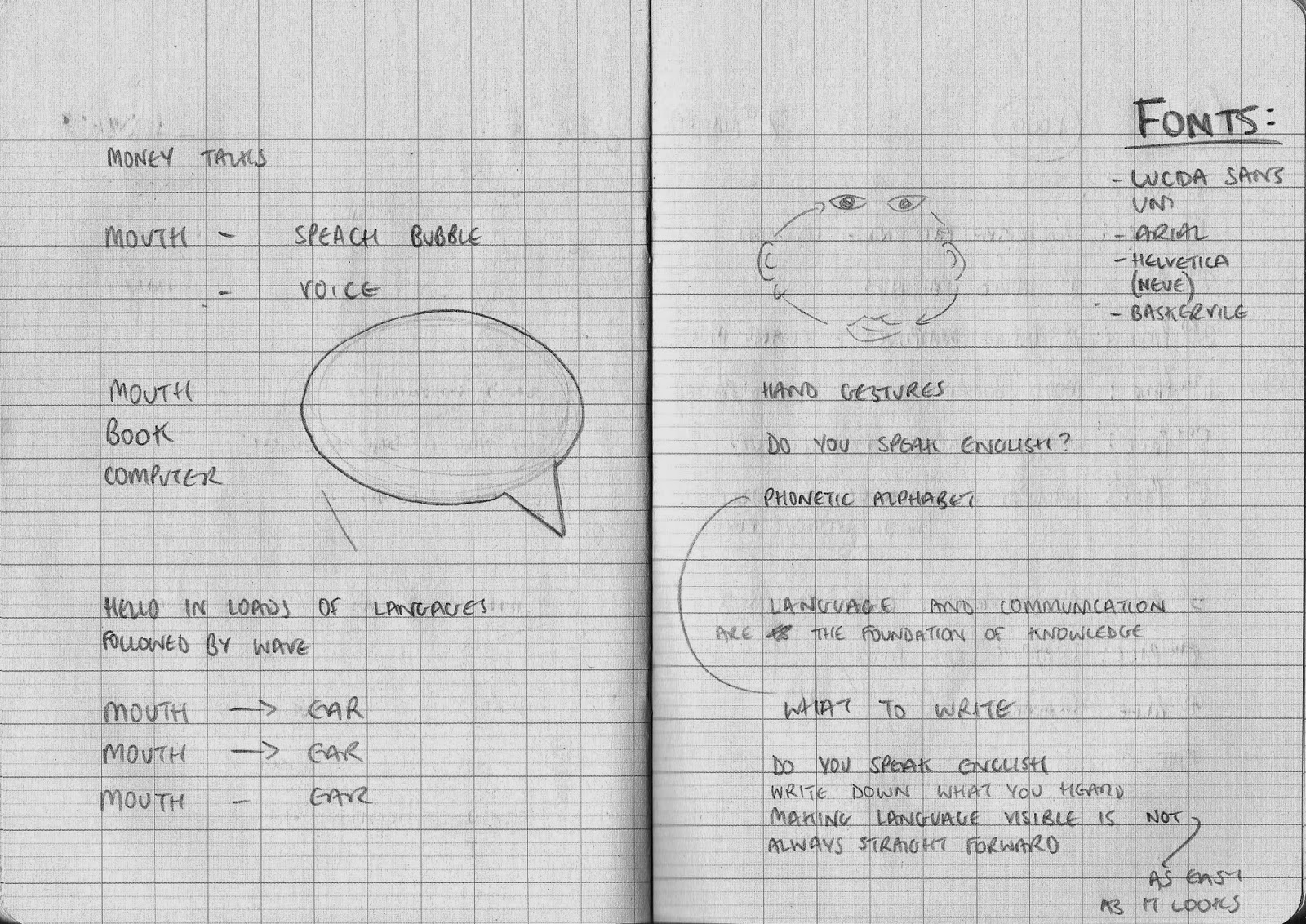
Once I had a few ideas I began to sketch and write them down. Out of several possibilities, looking at language, symbols and sounds I chose to focus on using phonetics.
Now that I had chosen a concept, I needed to decide on what the phonetics would say. I wanted them to have a dual meaning, reflecting the theme. The phrase I decided on was 'Making language visual is not always as easy as it sounds.' This sentence played on several elements of dialogue, its language part, its visual aspect and its verbal characteristic. Now that I had my concept and content, I tried various layout designs to see which one looked the best.


At this point I also experimented with typefaces. My options were quite limited as many font families do not have all the characters and glyphs required by the phonetic alphabet.
I decided I wanted to use a serif font as it was much more aesthetically interesting than a sans-serif. I also made the decision to left align the work as this was more balance and worked better on the page.
The final design:
At the exhibition:


The strengths of this project lie in the concept as, although it looks fairly simple, the idea behind it is well thought out and as multiple meanings.
The weakest part of the project was probably the layout as it is quite basic and there is not much to it, although specific design decisions were made.
The design does not have any other function other than what it is. It is, in effect, a piece of art and therefore, other than display, has no use.
No comments:
Post a Comment