The was a maximum of 10 boards and they had to be A4 landscape.
Rachel had already decided on the majority of the content so I had to lay it out. We initially met up and discussed what she wanted and I began to make some initial sketches. We also decided on the pages, their order and their contents.

.jpg)
.jpg)
Whilst working on the layouts of the boards I was asked to develop a logo as her existing logo was just her name in Times.
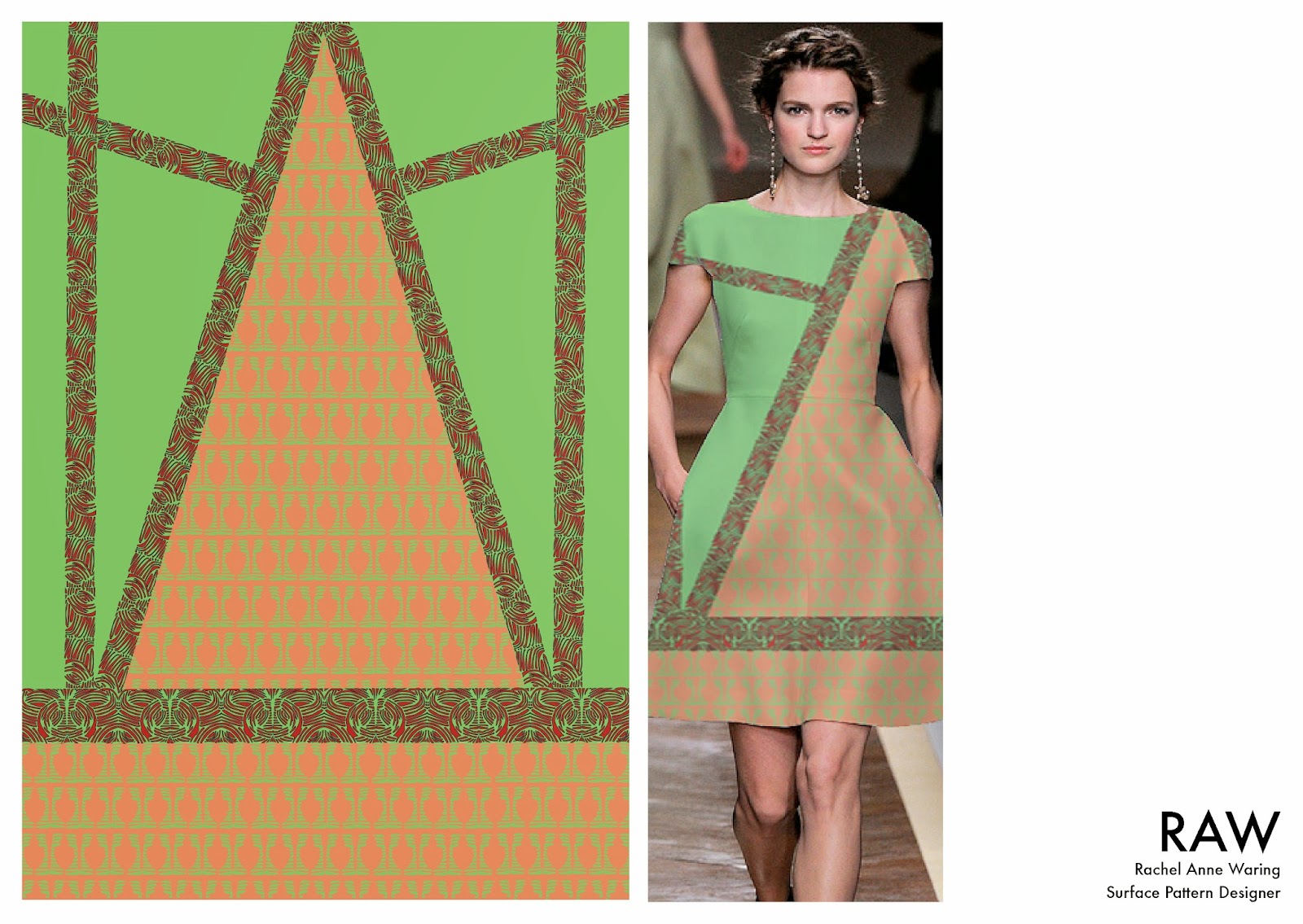
Boards
For the boards I produced several different possible designs. Each used a different grid structure and layout to provide a variety of options so that when I took the design to her we could discuss which were the best options and move on from there. *Different layout designs include some varied content and are not all identical.


For the first layout I used a very loose 6 column grid and was really just experimenting with different possibilities and what way the information looked the best on the page. The logo and information was positioned to the bottom right and right aligned. This was done as the majority of the content, or the larger images were positioned on the left so it balanced the board.


The decision to lay the pages out as DPS worked with some ideas and layouts, however, it made it difficult to produce work that flowed and was consistent throughout all of the boards. Some content was much harder to layout than others; this was due to its shape and how much content there was for each board. This also made consistency quite difficult.


As with the previous design some layouts work, however, there are some boards where the content does not fit with the layout. This causes a consistency difficulties. For this layout I initially used a three column grid and adapted it to make the content more interesting.


After a discussion with Rachel, we both decided that using the 4 column grid worked well, leaving the 4th column free for the logo and any written information. This design is very similar to the design that was chosen and used for the final boards.


The final layout used a 12 column grid as a guide and filled the space accordingly with the content. I wanted to break the content up so that it was all visible and each board had impact, however, I didn't want to overcrowd them. To create impact without overcrowding or making the boards look bare, I aligned all the content to the left and limited how many columns the content could fill so that there was breathing space around the logo as this is important information.
Logo
After some initial discussion about the
logo, we set some restrictions, specifically on the content and what needed to
be said. The logo itself could just be her initials (RAW) but she also wanted
her full name (Rachel Anne Waring) and Surface Pattern Designer included.
I wanted to produce something that was
sophisticated could hold its own and
stand out in the industry, whilst also reflecting Rachel as a person and designer.
I began the process by sketching a variety
of different options, making them as different as possible. From the beginning
I had a concept that I wanted to push. Rachel’s initials spell out raw, which
was something that I thought was fantastic. Not only did this make life easier
on my part it also already had an energy and impact that a logo requires.
Another element of her initials that was very useful was the ‘A’ and the ‘W’.
When written in upper case, the angles are very similar – if not the same – and
this is something I wanted to play with.
.jpg)
I had a personal favorite amongst my
sketches and when discussing the logo with Rachel, this was fortunately also
her favorite.
In the initial sketch I had removed the
crossbar on the ‘A’ to give the logo a rawer feel and as an attempt to make it
stand out. Although I had produced it without I wanted to see what the ‘A’
would look like with different crossbars in different places.
.jpg)
.jpg)
.jpg)
.jpg)
From this experimentation I decided that
the ‘A’ looked more interesting without the crossbar and was still readable
which was the most important thing.
I then proceeded to draw a conjoined ‘AW’.
With this drawn out, I realized that several elements didn’t look right – this
was because the angles were not correct.
.jpg)
Having redrawn the ‘AW’ accurately so that
all the angles worked, I was still unsure about the lack of cross bar so again
experimented with various possibilities.
The different possibilities included the cross bar only through the ‘A’,
the crossbar through the ‘A’ and the ‘W’ but not overlapping and the crossbar
progressing right through the ‘A’ and the ‘W’ with an overlap on each side.
.jpg)
.jpg)
.jpg)
1.jpg)
With the ‘AW’ decided I no needed to draw
out a ‘R’ that complimented and worked with the ‘AW’. I again drew some
accurate initial sketches to try and get a feel for the letter and what would work
best with the existing ‘AW’.
To start with, I could not get the ‘R’ to
fit with the design of the other letters as I needed it to be a certain width (without
it looking short and fat) and dissect at the level where the crossbar would be.
The problem was overcome by changing reflecting the exact qualities of the
‘AW’. The ‘R’ started with a thick stroke and was predominantly this stroked
apart from the stem. I experimented with various stem positions before making
the decision that this also needed to be a thicker stroke.
.jpg)
.jpg)
.jpg)
.jpg)
Having redrawn it with the correct stroke
widths there was still something missing and it did not work with the ‘AW’ as
well as I had hoped. After a discussion with some of my peers, the decision was
made that serifs were needed on the ‘R’ so that it was in keeping with the rest
of the logo.
I again initially tested this idea before
it was decided upon.
.jpg)
.jpg)
Now that each letter of the logo had been
decided on, it could be drawn out in full before being finally digitized.
With the logo now complete I needed to find
a typeface that complimented my hand-drawn type for Rachel’s full name and
occupation. The font that I chose was Futura.
This is still an ongoing project and have
recently been asked to produce a business card for her and other printed
collateral.
No comments:
Post a Comment