Secret
7” is a global competition that is open to creatives from around the world. It
is a charity competition, ran by Talenthouse, that is this year raising money
for Art Against Knives.
The
competition is to design a 7” vinyl sleeve cover for one of the 7 artists to
choose from. The artists that we were able to choose from are:
Public
Enemy – Harder Than You Think
Elton
John – Bennie and The Jets
Nas – The Don
Jessie
Ware – Still Love Me
HAIM –
Better Off
Laura
Marling – The Beast
After
listening to the all of the songs I decided to produce an album cover for Nas –
The Don. The reason I chose this song
and artist was because I thought there was more potential.
To
start my work I researched into album covers and artwork and Nas’s existing
album covers. This research can be found on my Design Context Blog.
Once I
had done my research I started producing a variety of ideas and small thumbnail
sketches. I chose to focus on imagery I associated with a Don. The imagery that
I mainly focused on was roses, cigars, money and suits/bowties.
Have
produced a wide selection of initial ideas I started to develop them further. I
acquired all of the objects I needed and began to photograph the in various
different positions and form various different angles. As well as photographing
the object on its own I also photographed them together and in use. The object
that I focused on the most was the cigar, taking multiple photographs from the
cigar as a whole, to its smoke and its ash and end. By photographing the cigar
like that I allowed me to have a selection of images to work with. The bowtie
and the rose were also photographed from several angles and positions so I
again had a selection to work from.
With
all of my photographs taken I began to manipulate them, changing their
brightness and contrast, hue and saturation and cropping the areas I wanted.
Now that I had all the imagery I needed it enabled be to start properly
visualizing my ideas. I created a variety of different designs, based on my
thumbnail ideas.
In the
final crit I presented all of my completed designs and asked what was wrong
with them, how could they be improved and which ones were the best.
From
the crit it was made aware to me that some of the designs were too cluttered
and therefore less effective.
After
more discussion it was decided that some of the simpler ones lacked impact and
therefor should not be used.
This
left three potential designs to put forward. The first of the three designs was
very simple and very powerful and did not need any changing. Overall the
feedback was very positive, especially regarding the high quality of the
photographs, however, with this cover the feedback said that it is not entirely
clear and understandable unless you know what you’re looking at.
The
feedback for the second possible design was very positive, again praising the
quality of the photograph. During the crit several suggestions were given,
these suggestions were: superimposing the diamond shape onto the smoke in
various sizes and make the image black and white. After the crit I experimented
with all of the suggestions to see whether they improved the cover.
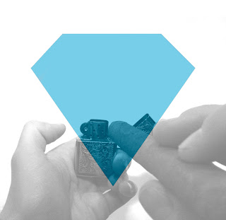
The
final design was said to be the most powerful and the most interesting. The
feedback was, on the whole, positive, however, it was said that the photo
looked slightly forced and not as natural as it could have looked. The feedback
also liked the concept of first person view. There were several suggestions
given to improve this design, these were: change the size of the diamond, put
the diamond as the flame of the lighter and add smoke to the diamond.
I again
experimented with all of the suggestions and found that adding smoke to the
diamond proved very effective and this is the idea I chose to submit.


No comments:
Post a Comment