NORTON & SONS
The
rebrand and new logo was designed to ‘speak of modernity’ and ‘remain
old-fashioned and exclusive’.
‘If it feels a little bit
untouchable, I think we’ve done it right.’
‘We don’t want to be
accessible.’
‘We are not accessible, we are very
expensive, we are very exclusive and we don’t make any excuses for that.’
Patrick
Grant
Director
The
logo and brand had to be;
-
Unique
-
Individual
-
Expensive
-
Classic
‘Re-crafting
187 year old image for the post-millennial generation’
The
‘new old-fashioned logo’ had to appeal to the young customers – the future.


Story
The
rebrand was to attract new clients, yet still have a relevance to the
long-standing, loyal clients.
It
had to convey how a Norton & Sons suit is a piece of art and specifically a
piece of British art.
The
main focus was the importance of ‘Britishness and British making’.
‘The
Englishman at large’.
System
Changes,
development and qualities of the new logo and rebrand:
-
Modern identity.
-
Emphasise rich heritage.
-
Original crest redrawn.
-
Original, idiosyncratic wordmark redrawn.
-
Royal warrant reinstated as a sign of history and
quality.
-
Reflect high quality craftsmanship.
-
Colour: Reflect the sober, soft-to-touch wools and
cashmeres of the suits and the silks of the linings.
-
Used mostly British archive typography to show structure
and bespoke nature of the suits themselves.
Archive Advertising Claims
‘No other address’
‘No branch houses or agencies
anywhere’
’16 Savile Row’
All
of this is portrayed through the very simple, fine, vertical line.
The
rebrand included designs for:
-
Clothing labels.
-
Passport books for each suit.
-
Concepts for interior of salon.
-
Shop window.
-
Bespoke storage boxes for records.
-
Stationary.
-
Business cards.


Rebrand
by Ben Wolstenholme, Moving Brands.
STANLEY
Stanley
was established in 1857 and is well known for its manufacture of hand tools –
most famously the ‘Stanley Knife’.
After
its merger with Black and Decker and its expansion into new industries;
security, healthcare, infrastructure and oilfield services, it wanted a logo
that would communicate the breadth of the brand.
Rebrand
had to:
-
‘Signal the evolution of an agile, unified brand
connected by a single concept.’
-
Show ‘Performance in Action’.
-
Show the company’s rich heritage.
-
Be dynamic.
-
Free the name from the holding shape of the only logo.
Logo Design
‘Notch’
in the letter ‘N’ resembles the blade of the company’s famous ‘Stanley Knife’.
Shape
forms an up-ward arrow representing ‘action’.
The
colours are the signature Stanley colours, that are known globally.
Wordmark
is a simple sans serif that portrays the company’s robust nature.
The
‘notch’ is in the center of the logo and word, drawing your attention towards
it.
The
single unique trait, combined with the company’s trademark colours make it
instantly identifyable.


Rebrand
by Lippincott.
THE FAT DUCK
Heston
Blumenthal’s 3 Michelin star restaurant rebrand changed the whole appearance of
the company.
The
three themes that were focused on during the rebrand were:
§ Experience
§ Tradition
§ Nostalgia
All
aspects of the visual identity were changed:
-
Corporate mark
-
Wordmark/logotype
-
Restaurant interior
-
Menus
-
Utensils used by diners
Logo
Using
the three themes – experience, tradition and nostalgia – as well as the name of
the restaurant and what it is the logo was designed.
The
logo is an amalgamation of cutlery and duck. A clever manipulation of imagery
where the spoon is made up of a duck’s beak, the knife – a duck’s feather and
the fork – a duck’s foot.
The
appearance and shape of the cutlery half of the image, combined with the use of
lines, suggests a silver set with connotations of quality, sophistication,
elegance and tradition.
The
imagery also fits with Heston’s style of weird combinations and alternative
approaches.
The
Roman serif font (The Fat Duck) suggest tradition and sophistication and when
juxtaposed with the more modern and edgy gothic sans serif font (heston
blumenthal), reiterates Heston’s alternative approach to cooking.


Rebrand
by The Design Laboratory at Central Saint Martains College.
ITV
The
rebrand of ITV was done to reflect their wide programme mix and compete with the
‘informative BBC’ and the ‘provocative Channel 4’.
The
logo was designed to be friendly and warm and to have a form that flowed.

Colour
The
colour is an especially key element in this logo.
The
main logo, known as the ‘Hero’ logo, had to cover all aspects of the brand. To
do this, colours were chosen that spanned the whole spectrum.
The
colours had to be lively and joyful, whilst at the same time be appropriate for
the serious corporate side of the brand.
The
colours were chosen so that the worked on both a white and black background.
The four colours stay the same but, depending on the background, the upright of
the ‘t’ changes.

One
of the unique parts of the rebrand is the ‘Colour-Picking’. This means that the
logo can reflect the mood and tone of the program or advert by taking colours
from the image. This makes the logo accessible to everyone and fit with
everything.
‘Fuse
logo with imagery, rather than just ‘badge’ it’.


Font
The
workmark was based on handwriting, providing a warmth, a friendly and a human
quality.
The
typeface was designed in collaboration with Fontsmith.
Cues
were taken from the logo, combining the straight and round terminals.
Has
a clear personality and works in diverse situations. From the serious – the
news, to the not so serious – The Only Way is Essex.

As
well as ITV the rebrand also covered the other channels:
ITV2 - ‘Fresh
entertainment’
ITV3 - ‘Crafted
Drama Collection’
ITV4 - ‘Haven
of sports and cult classics’
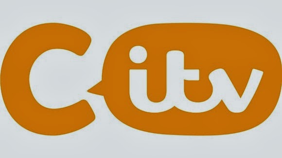
CITV - ‘Wickedly
playful stuff for kids’


The
logo and design provides a seamless transition, presenting a mainstream and
high-quality, fresh and contemporary brand.
The logo was designed to give of the same warmth and friendly feel regardless of the size.

Rebrand by Rudd Studio/Fontsmith/ITV Creative
No comments:
Post a Comment