Initial sketches
1st person
Typos
Food stains
Print problems
Poor print resolution
TLDR
Scrapbook
What should be on your boards;
Board numbers - 01/05, 02/05, etc.
Titles
Own work
Name
High quality photos
Personal note to self;
Proof read everything - spelling and grammar.
Print in black & white as a proof.
We then analysed each others design boards from the previous module, pointing out the problems and issues with them.

The comment on this page was asking whether it was required as it is not doing very much. I wanted this board to act as an impact board but it lacks the impact needed to stand out. This therefore needs redesigning or removing.

The comment on this board was that there was too much text scattered over the page. Stepping back and looking at the board I can see this is the case. I tried to lay it out interestingly by putting in a lot of information and then highlighting the relevant. The font sizes are to over-bearing and should be reduced or regular rather than bold if it was to be done again. The image of the cover also makes the layout look off as, although it fits the grid, the lack of obvious boarder means the eye tries to align the content.

The issues found with this board was regards the alignment. This is a similar issue to the board above as, although the images fit in the boxes, their original layout is not identical and therefore does not fit and align.

The issue with this board is a lack of consistency regarding image size and layout. I completely agree that all the images should be the same size and that a more organised layout should be used when displaying this many images. This is something I will think about when creating design boards in the future.

The issues on this board were a lack of numbers, a lack of name and use of the first person. In future the board should all be numbered, all have my name on and avoid the first person completely.

On this board there was the use of first person and several spelling/typo mistakes that would have been avoided had the boards been thoroughly proof read.
The relevance of content is also something that I need to consider with my boards, however, I think that when I stop using the first person the content should rectify itself.

The issues found on the above board were a lack of structured layout. Although I had used a structured layout, the images didn't look as well laid out as the could have done.

This board had a poor quality image and and a spelling mistake, problems that can and would be removed with proof printing and proof reading.


There were a few issues with this board. There was a couple of typo/spelling mistakes and a size/alignment issue with on section of the board. Again, these are things that will be rectified through proofing.

This board had several typos and spelling mistakes, all things that would be rectified by thoroughly proof reading it.
We then had our research boards for our up-and-coming brief analysed;

The issues with the above board were; the grid between the pictures on the left. The reason they have a different grid is because they are one image that was previously gridded.
The next issue was regarding the paragraphs. Three of the paragraphs had 'widows' (something I had never heard about but refers to a single word being left on a line). I want to look at the rules regarding this as I think having it with 'widows' breaks the text up.
The final issue was TLDR. As these are research boards all the information is written by an external source.

The same problems were picked up on the above board as with the first one. The additional problem that was highlighted was a poor quality image. This is something that can be rectified now and could have been rectified previously had the boarded been proofed.
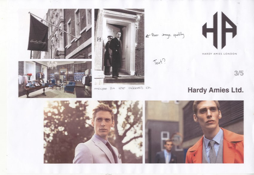
The issues with this board were some poor quality imagery and a lack of information. The poor image quality can be rectified with proofing. The reason there is not as much information on this board, is because I thought there was a lot on the others and I therefore wanted to break it up.

Some of the same issues have again been picked up here. The issues found on this page were the 'widows' previously mentioned and TLDR.
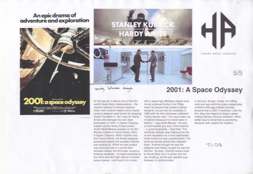
The same issues were again present on the final board. There was too much body copy so TLDR was written. There was also an issue with the spacing between inages, however, this was because the poster has a white edge that cannot be seen on the white background.
Overall I thing the most important things I need to include on my boards from now on are my name and board numbers.
No comments:
Post a Comment