For the design of the publication I wanted it to reflect the content. I therefore wanted it to be simple yet sophisticated and elegant.
I initially began sketching a variety of different thumbnails of possible DPSs.
As I was sketching I began to make design decicions such as what content would go where, what elements of designs needed changing, how the page numbers would be written and what size margins should be used on the pages.
I then proceeded to sketch out the layouts I though were the most applicable on a much larger scale to get a better feel for how the actual publication would look. This allowed me to estimate how large the images would be and what point size would be readable.
I originally wanted the cover to be printed on a separate stock to the content, a thicker more substantial stock.
My initial cover design;
I used the monogram as the logo on the front and it as a pattern on the inside of the cover.
The quote on the back was taken from Hardy Amies book The ABC of Men's fashion and was added to stop the cover from being blank.
The content was initially laid out like so;
We also needed to package our research booklet. As my publication was not going to be enormous, I opted to design an envelope.
I couldn't decide whether I wanted the envelope to be in the same stock as the publication or something that was more substantial or a different colour.
I created several different possible envelope designs which were to be laser cut;
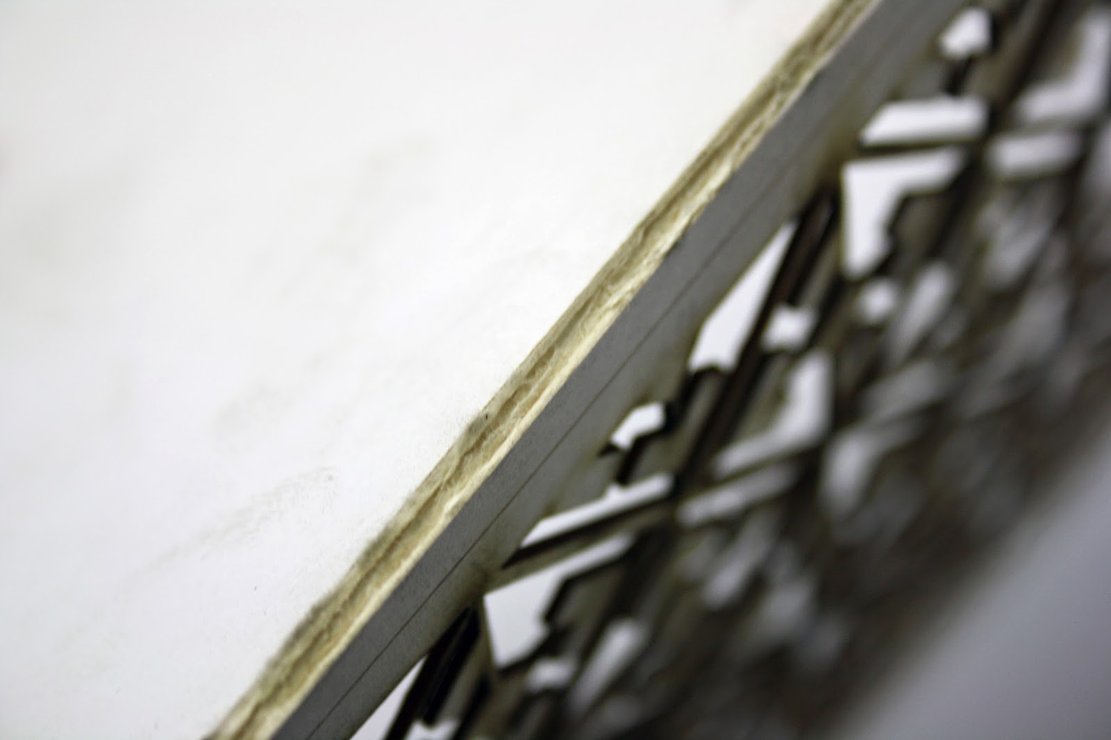
I chose to laser cut on 4 different types of stock. Cartridge paper, white card, blue card and mount board. This gave me a variety so I could see which one looked the best and which one functioned the best. As well as the different designs, I also used different settings on the laser cutter to create different envelopes.
The kiss cut in the cartridge was barely visible and was not effective at all.
The cut-through logo on the cartridge worked well, however, the stock was not substantial enough to act as an envelope.
This was also effective on the blue, however, there were as couple of problems with this stock as well. The blue was not a good representation of the blue that I wanted and the logo would reveal the information underneath, something I did not want.
Neither of the blue stocks I found were the correct blue, however, I still proceeded to experiment with them so that I had an idea of how the packaging would look in colour.
When I tried to etch the pattern onto the card it did not really work at all as the edges became blurred and the paper turned a green colour.
When I tried to use a more substantial stock, mount board, it was problematic in two ways.
The first issue was that when cut by the laser it left a lot of burn marks that completely discoloured the stock, making it useless.
The other issue with this stock was that when folded it just ripped and broke off, again rendering it useless.
The cartridge paper had fewer burn marks, however this was very thin and therefore quite flimsy. I wanted a functional but substantial stock to encase my publication in.
Off all the stocks I tried the white card was the most effective. It had all the properties I wanted as is it was both functional and substantial. The only issue with it was that there were still obvious burn marks throughout the design.
At this point we had a crit of the work so far. The feedback I received was;
This feedback was really useful as it provided me with some techniques I did not know, which would enable me to remove the burn marks from the work.
It pointed out the errors that were in the work, such as pixelated images and layout issues as well as suggestions on how the publication should be bound.
I really liked the idea of the publication being stitched as it is a very appropriate technique due to the contents of the publication.


No comments:
Post a Comment