We were separated out into groups of three, with each trio randomly picking a trade/company.
We were told to treat this as a start up business as this makes it easier to create the entire brand.
We had to create the brand guidelines/brand style guide which should to include;
Concept
Logo & application
Typography/Number systems/Leading/Tracking
Colour selection
Layout & Grid
Tone of voice
Copy
Web

We had to think of all the different possible applications of the brand.
I was in a trio with Bobby and Tristan and our profession was mechanic.
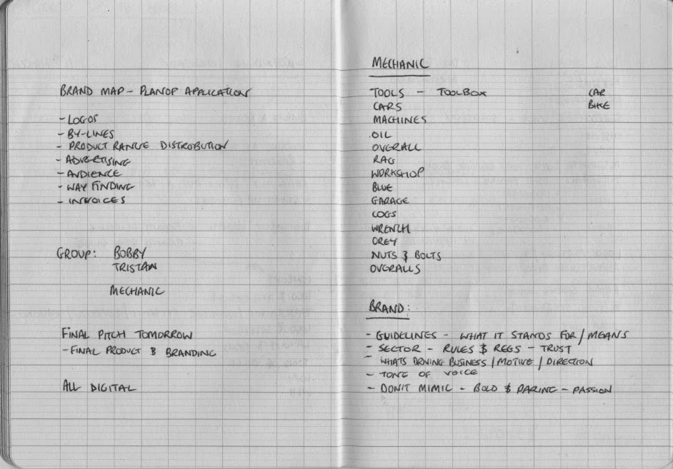
We initially though about the profession and listed words that we associated with that professions. This was done to give us a broader starting point from which to build a brand from.
As well as looking into the profession we also noted down the key aspects that we needed to consider when producing the brand.

We set out all the different elements that needed to be considered in the guidelines so that we could use it as a check list at a later date but also so we could manage the work.
At this point we made a decision on what the company was going to be. Due to Tristan having a keen interest and knowledge of bikes we decided to create the identity and guidelines for a bicycle mechanics/repair.
With this decided we could begin the designing and development of the brand. We each set about coming up with a name for the company as well as a logo and mission statement.
I began by writing down the element require to produce the visual identity, these were;
Name
Logo
Logofont
Font
Typeface
Colours
For the mission statement I also noted down the key factors that should be in the statement;
Who
What
Why
The mission statement is the entire ethos of the brand and therefore should be focused, positive and driven.
My initial mission statement read as thus;
'We aim to deliver a reliable and dependable service, bespoke to each customer. Whether you are a professional or recreational rider. The service we provide, be it a puncture repair or a MOT on your bike...'
Although unfinished and brief, there were written elements that started to define the brand.
I also began to sketch some initial logo ideas down. I used the name Bespoke or Bespokes.
This name was appropriate as it had connotation of the bespoke service that we provide to our clients but it also had reference to the spokes on a bicycle. We decided we needed to cement a name for our brand before we could move on to the next stage of the project.
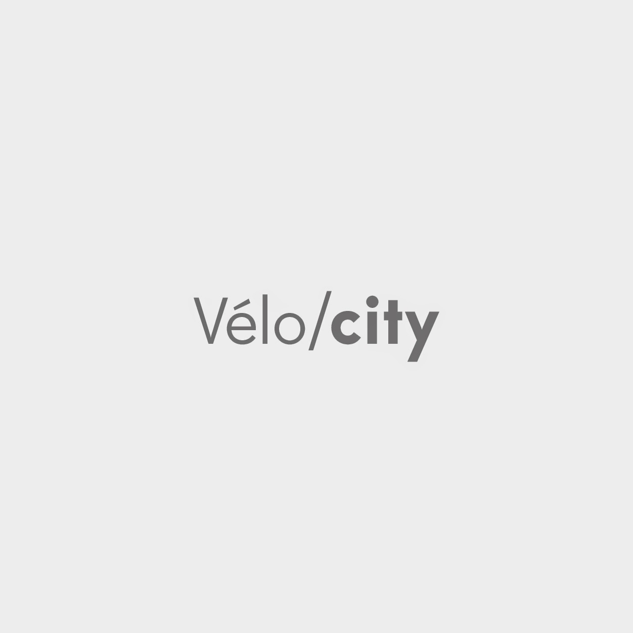
After some discussion we decided on the name Velocity. As with Bespoke this had multiple meanings and connotations.
First, the word velocity means the rapidity of motion or operation; swiftness; speed: a high wind velocity. In terms of a mechanic it means
the time rate of change of position of a body in a specified direction. These are both appropriate and relevant to the nature and business of the company.
The second is when the word velocity is split it forms two more appropriate words. Velo is the french for bicycle, obviously appropriate as we are a branding a bicycle repair company. City is also appropriate as we want to focus on road bike and, although it sounds obvious, there is a correlation between roads and cities.
I continued to develop logo ideas using the name velocity and also attempted to rewrite the mission statement.

The final mission statement was;
'Velocity is a reliable and dependable road-bike repair maintenance company. With expertly qualified mechanics, we offer a professional quality service, whether you are a tour racer or a causal rider. We strive to provide excellence at sensible prices.'
At this point we separated and began working on separate components. My task was producing all of the brand guidelines for the company. Bobby was designing and mocking up printed ephemera and Tristan was designing our website.
I designed the logo and chose the logotype.

The logotype was Edmondsans Regular and Bold and the chosen colour was Pantone P 124-5 C.
I also produced the logo as just type and in black and two greys. I also produced it in reverse so that it could be used across a variety of medias and backgrounds.


For the body copy Edmondsans Regular would be used and for any Headers Edmondsans Bold should be used.
We had also decided that in the future we would want to open stores internationally and for that we would adapt the logo depending on what city the store was in. The logo would be Velo/ then a three letter abbreviation of the city.


I noted down all the brand guidelines before mocking them up and putting them into a publication.


Final Brand guidelines:
The whole project accumulated in a presentation of the company, all the brand guidelines and information about the company.
Whilst I was working on the brand guidelines, Bobby Designed and mocked up a selection of printed ephemera.


Tristan designed the website for Velo/city.


No comments:
Post a Comment